
Our typeface is called Vi and is designed to be friendly and functional.
What's on this page:
Our typeface
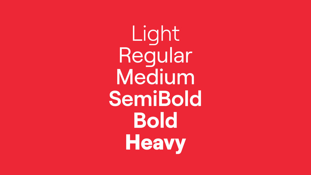
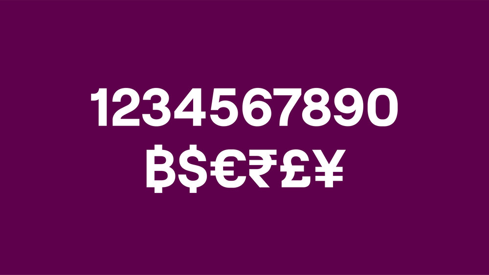
Our typeface ‘Vi’ is a geometric typeface designed to be simple, friendly and functional. It comes in six weights – Light, Regular, Medium, Semibold, Bold and Heavy (as well as italics). It is used for all purposes from digital to print.
’Vi’ was designed by Displaay foundry and is a customisation of their typeface Roobert.


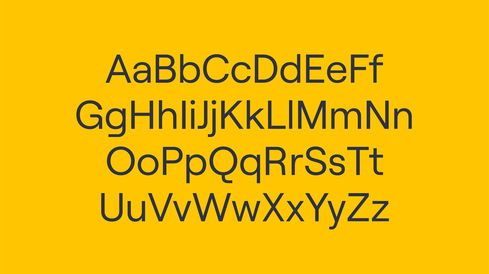


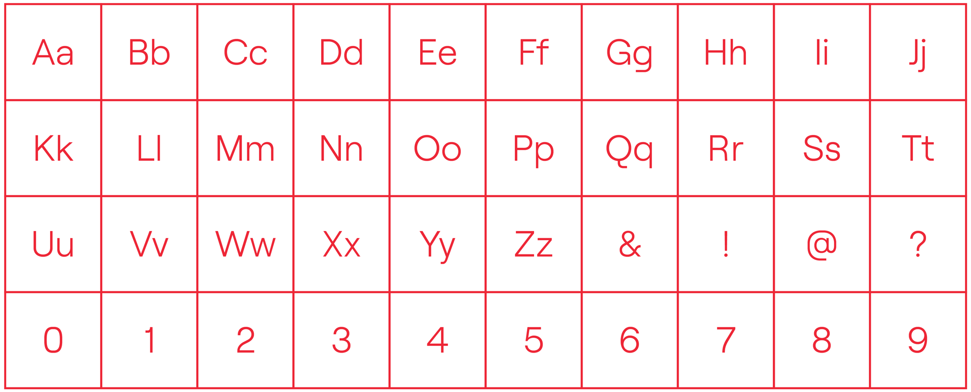
Character set

Hover to reveal other weights ↗
Try me...
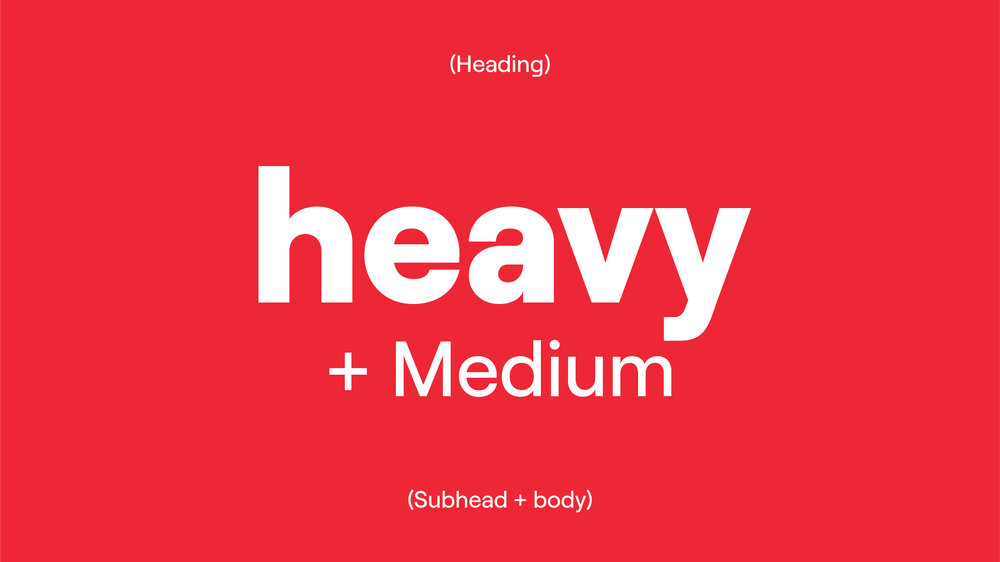
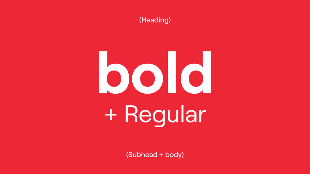
Pairing
These are the optimum pairings to ensure clarity, hierarchy, and impact across varied communications depending on the message. Heavy should always be paired with Medium and Bold with Regular. Semibold and Light are reserved for digital usage.


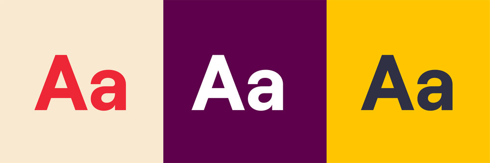
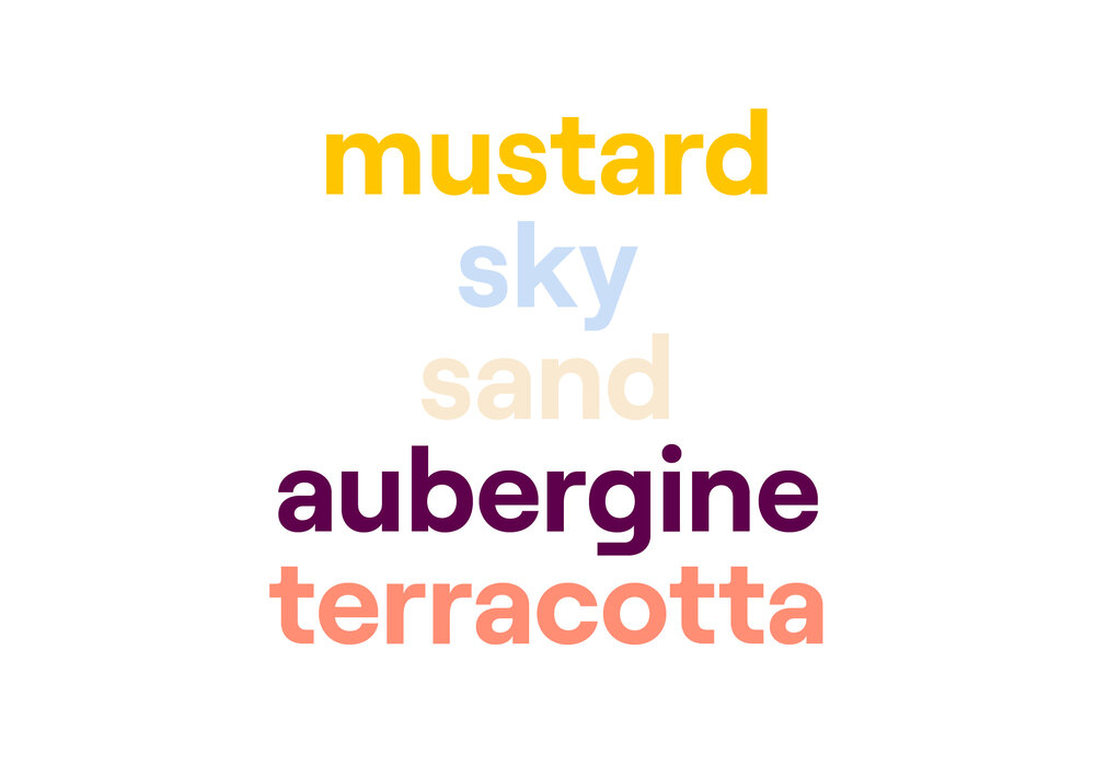
Colour
We use type in three different colours – Crimson, white and Slate. Always ensure that the type contrasts with the background. Refer to the colour section for more details on accessibility and recommended combinations.

Price points
Price points can be highlighted in two primary ways: through price point capsules, or in headlines where they can be called out using colour.

Price point capsules
We have a range of capsules that help us highlight price points as a hero or as a more restrained call to action. They are flexible enough to hold a variety of information and bold enough to stand out on complex backgrounds.


How to build our price point capsules


Feature price point


Restrained
Restrained vs feature
Restrained price points should sit at the end of the text and act as a call to action. Feature price points should be the focal point and work together with the headline to promote products or deals.
When price points are used on Mustard backgrounds, the bulk of the capsule should change to white. When used on Slate, the tag element should change to white (with Slate text).


Price points in headlines
If a price point needs to be the hero of an application, it should be featured in a price point capsule.
A price point used within a headline should, therefore, be a more simplified execution so as to not dilute the overall text it sits within and to not overcomplicate the composition or make it hard to understand - remembering our brand principles of straightforward and empathetic.
When featuring a price point in a headline, we can use colour to highlight the price in a more restrained way. Always test first to ensure legibility.


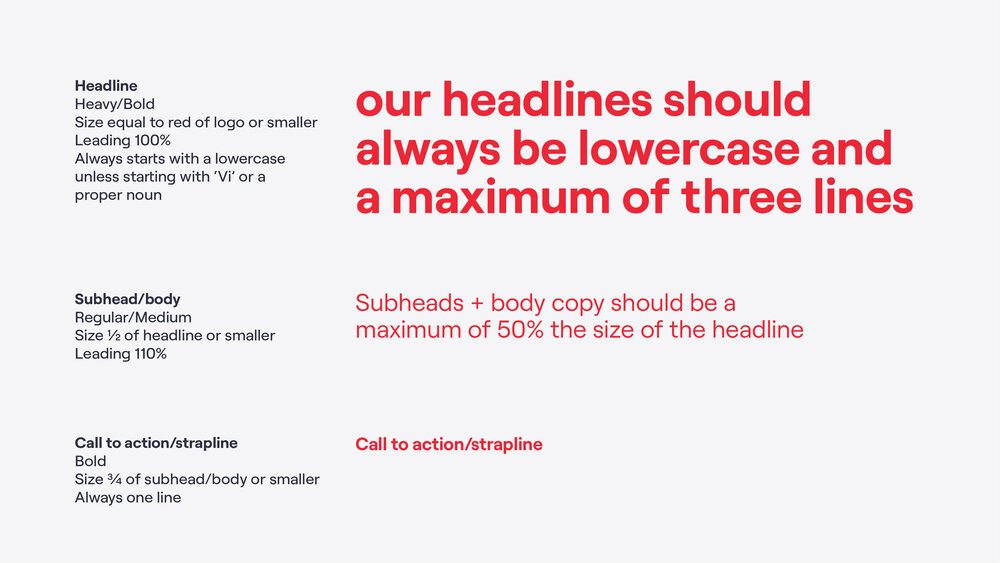
Usage and hierarchy
We have a standard and straightforward approach to setting type. By sticking to these basic type usage rules, we can maintain consistent use of type across our communications.
The majority of our type is left-aligned, and we should only centre type when it is used in simple layouts containing the trail expression.
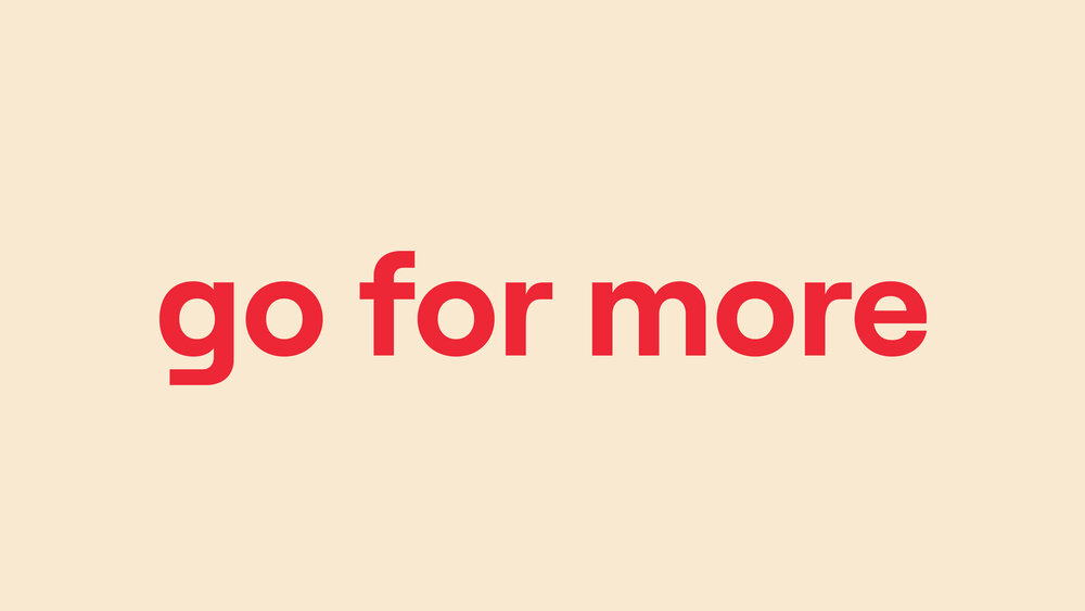
Our headlines must always be lowercase rather than sentence case.
See the layout section for more details on layouts and hierarchy.

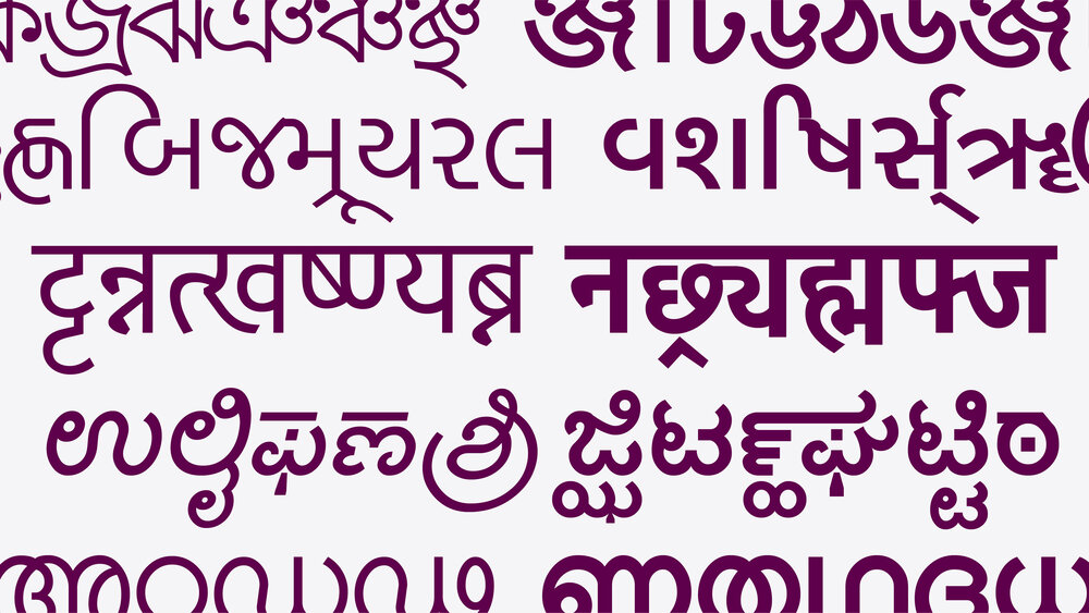
Local scripts
Local scripts are available to be used for the local language. These scripts have been chosen for their similarity to our Latin brand typeface (Vi) so care should be taken to ensure that the correct scripts are being used to build the strength and consistency of our brand. Contact someone from the design team for local script font files.
These should be used in roughly the same way that our Latin brand typeface is, e.g. use a Heavy/Bold weight for headlines and Medium/Regular for subheads and body.

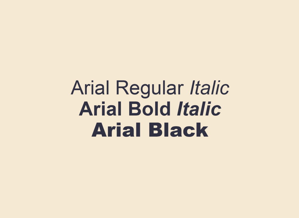
Fallback fonts
We have two fallback font options for when our brand font can’t be used (email, sending Powerpoints etc.). This is to avoid situations where default fonts get supplemented and alter the tone of our communications. For editable files, the receiver must also have our brand font installed on their computer.
Where possible, our brand font (Vi) should always be used. Poppins is our fallback font for Google Suite and Arial for everything else.


Google font
Our Google font can be used for any files created in Google Suite (Google Slides, Sheets, Docs etc.) as it’s available in the Google font library.

System font
For situations where both our brand font and Poppins aren’t available, we revert to Arial which is available on all systems. This is important to keep in mind when sending editable files.
Don’ts

× Don't use colored typography (Crimson, Slate and white only).


× Don't use all uppercase, there is no need to shout.

× Don't adjust use overly tight or loose kerning or tracking.


× Don't use mutiple text weights in one sentence.

× Don't use any other font than our brand typeface 'Vi' (except our fallback fonts Poppins and Arial, used in restricted applications).


× Don't start headlines with a capital. Headlines should always be lowercase apart from proper nouns and 'Vi'.
Things to remember:
01 Always pair Vi Bold with Regular and Heavy with Medium
02 Text should only be in Crimson, Slate or white
