
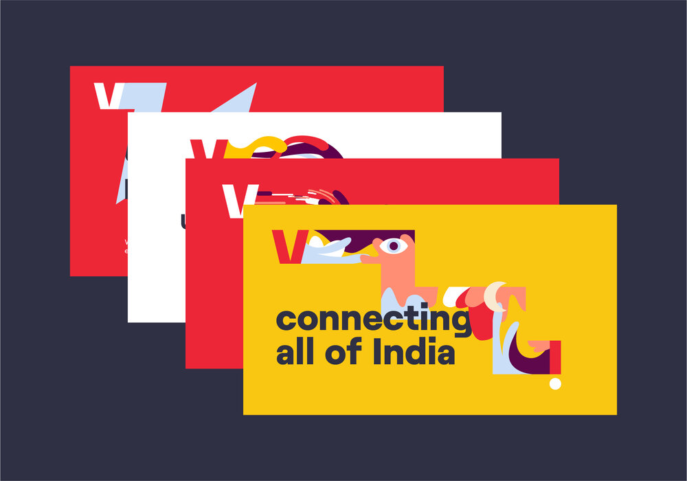
Our brand expressions
At its core, Vi is about opening up to put people and their needs at the heart. Our brand needs to be able to easily convey this idea in every visual – for that we have our brand expressions. These three expressions allow us to literally open up our logo to put whatever is needed at the forefront.
There are three ways we can express ‘opening up’ each with their own purpose.

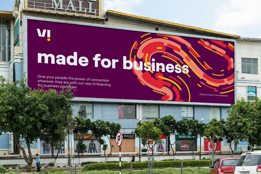
Frame
The frame expression is bold and confident. It should be used in designs with very little content that need to put all the focus on a particular product or image.
It is best suited for applications that need to stand out and want to make an impact through simplicity – think new product teasers.


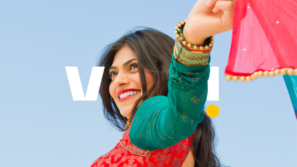
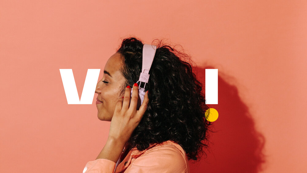
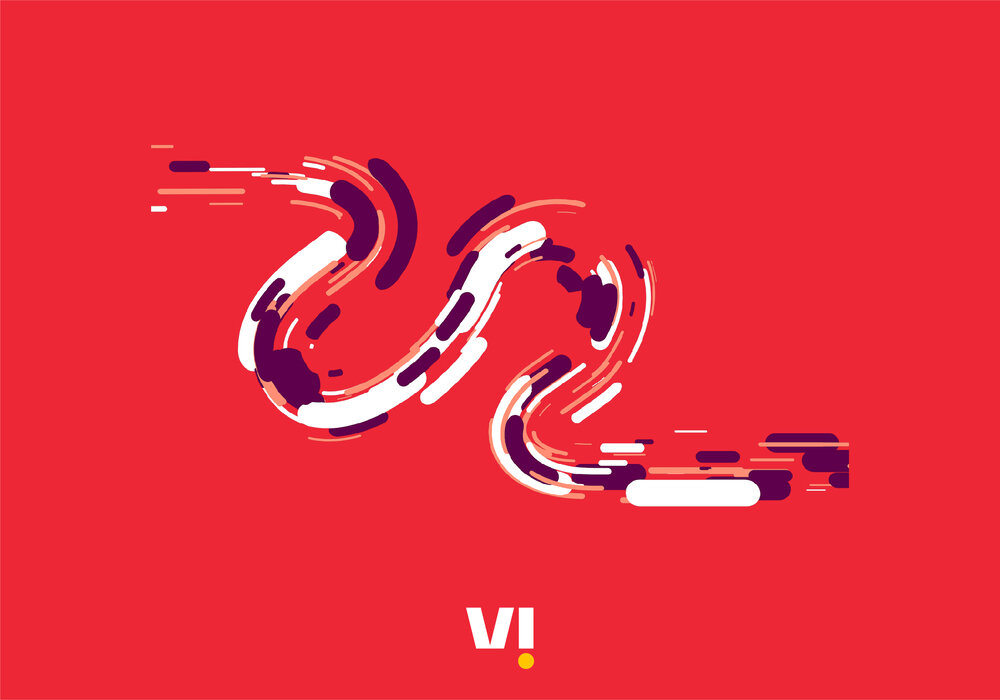
Trail
The trail expression is highly flexible and expressive – a great expression of our brand. It should be used in applications with little content.
The trail is best suited for applications with a small amount of content that need to make an impact through energy and richness – think large formats featuring a single message.
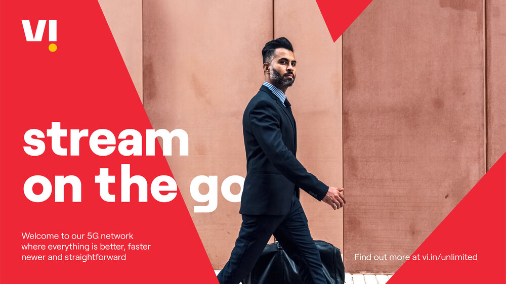

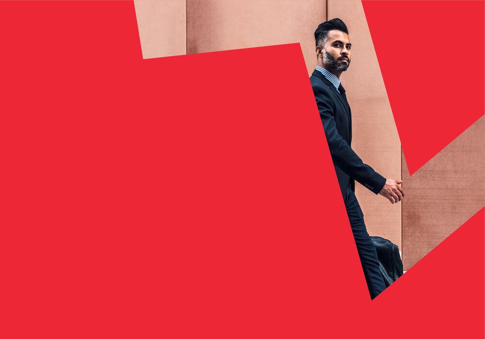
Crop
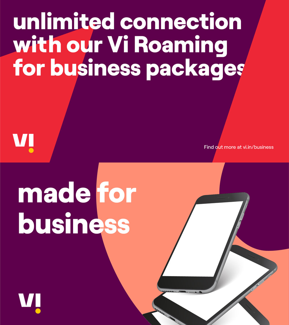
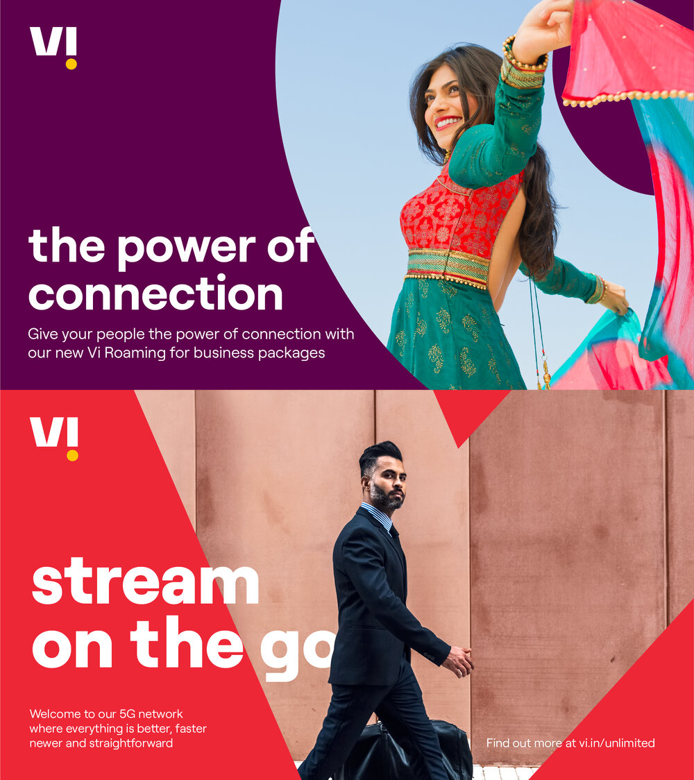
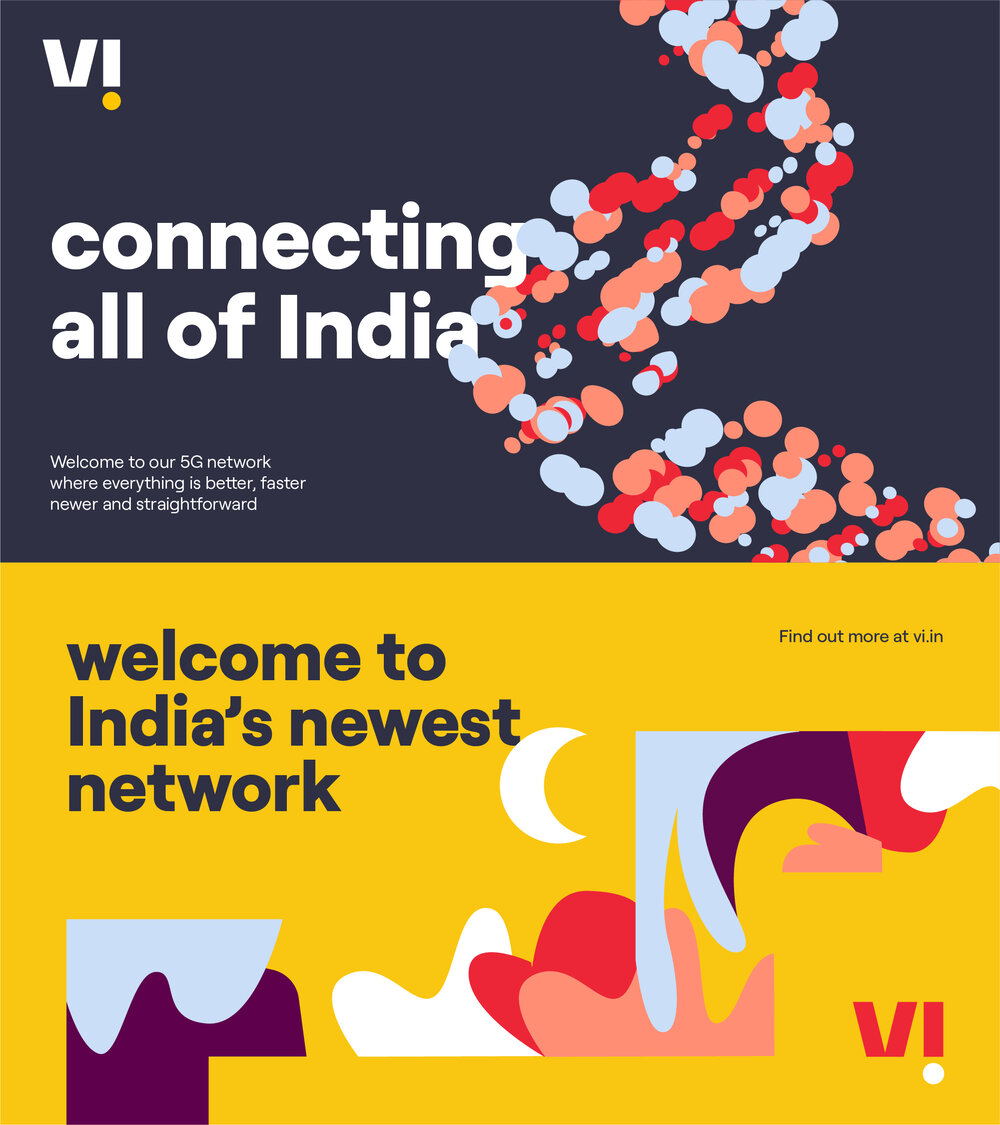
The crop expression is accommodating and inviting. It should be used in situations where there is a lot of content and should rarely be animated.
Crops are best suited for applications that need to convey a certain level of information but still need to feel Vi – think posters featuring and detailing new offers.
The brand expression tree shows the full range of possibilities across our brand expressions.


Frame
The simplest of all the expressions and can be used to place more focus on a given image.

Types of frame
Customers experience our brand positioning of ‘helping you get ahead’ in three ways: our network propositions, our telco propositions, and our telco++ propositions.
We use our frame expressions as a way of putting a spotlight on these different propositions.
In each frame expression, our logo opens up to reveal the solutions that Vi offers to help you get ahead; a visual representation of how Vi opens up to put its customers and their needs at the centre of the brand.
Importantly, the spotlight is always on the solutions that Vi offers to help people get ahead and NOT on the outcomes of these solutions. For instance, we might visualise a customer taking a Byju course on an iPad, but we would never visualise that person smiling at their graduation ceremony.


1. Network propositions
Purpose: Putting a spotlight on the strength of our network.
What we use:
Illustration*
* We use illustration by default to visualise abstract or complex subjects such as ‘network’

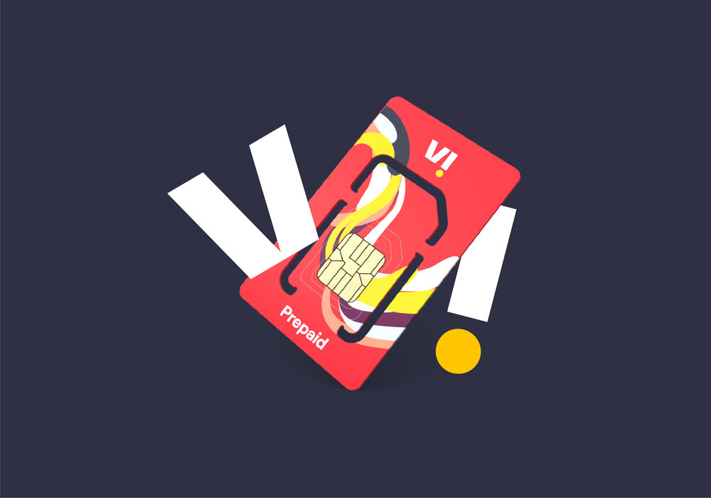
2. Telco propositions
Purpose: Putting a spotlight on our base offer of connectivity and entertainment.
What we use:
Photography (e.g. customer wearing headphones)
Product shots (e.g. SIM card)
Illustration (e.g. illustrated handset/ SIM card/ headphone etc.)


3. Telco++ propositions
Purpose: Putting a spotlight on our offer beyond connectivity and entertainment.
What we use:
Photography (e.g. customer taking a Byju course on an iPad)
Product shots (e.g. Amazon Alexa)
Illustration (e.g. illustrated cricket bat)
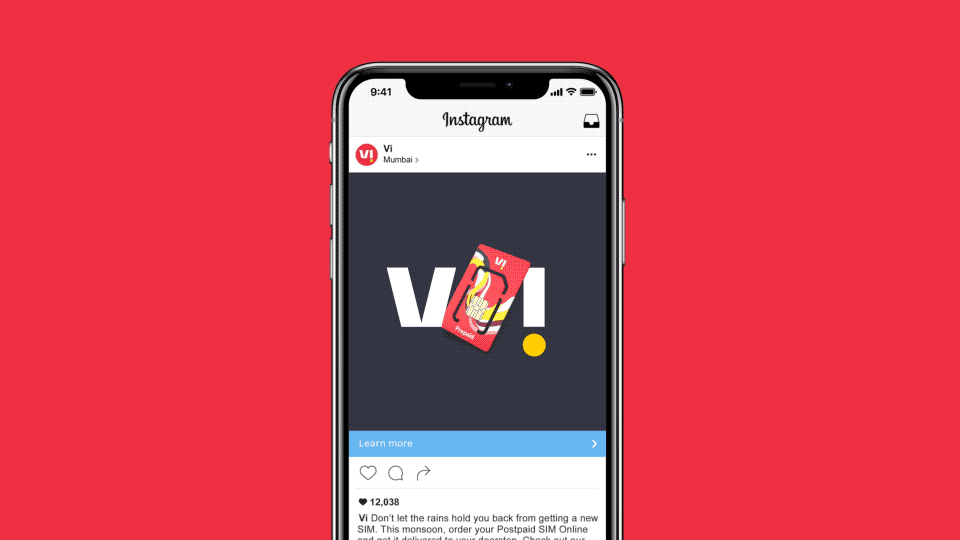
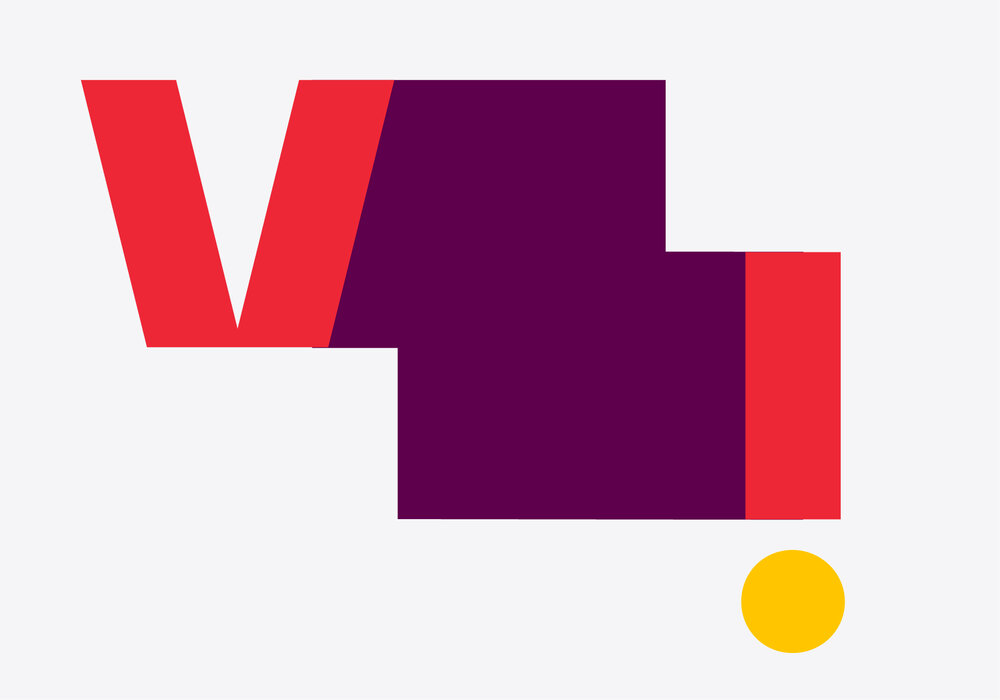
Creating frame expressions
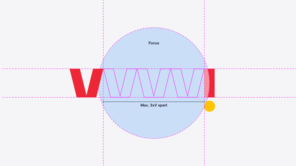
Creating frame expressions is reasonably straightforward, although for maximum impact some image editing is necessary for ‘telco proposition’ executions. When possible, layering should be introduced – this means editing the image so that part of the logo can tuck in behind.
This helps create a sense of space and the feeling that the logo has actually opened. This should always be done with the ‘V’ on top and the ‘i’ slightly tucked behind the focus.
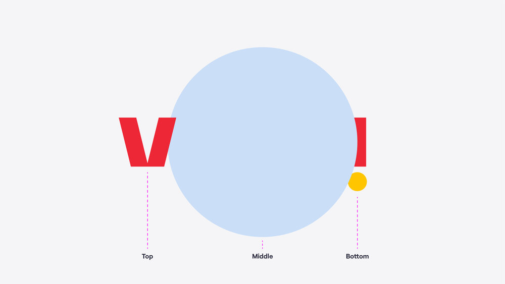

Spacing
It is important to note that the ‘V’ and ‘i’ of the logo should never be separated further than 3xV apart, and the logo and focus of the composition should always be centred.
The frame composition of logo + focus image should always be centred vertically + horizontally within the composition.

Using the frame expression
Best suited for applications that need to stand out and want to make an impact through simplicity – think new product teasers.
The frame expression is used at the end of this example.

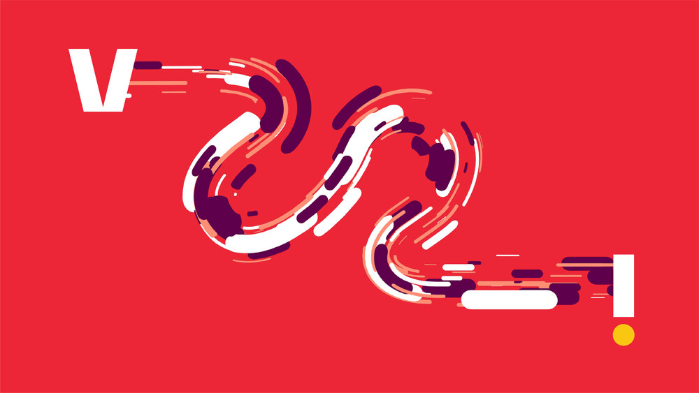
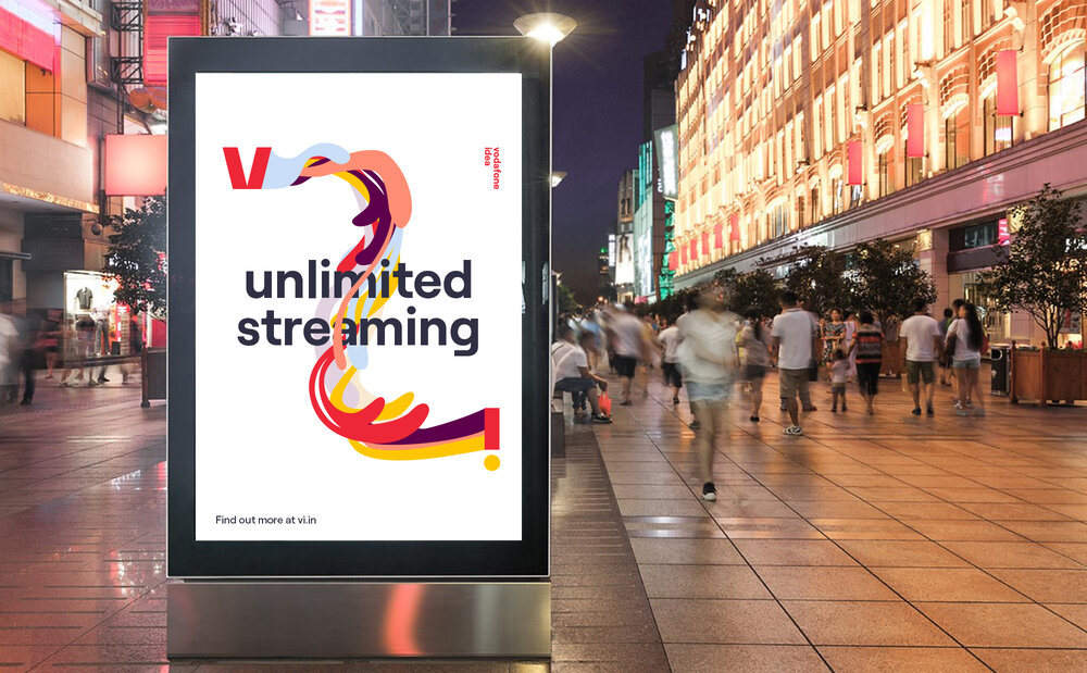
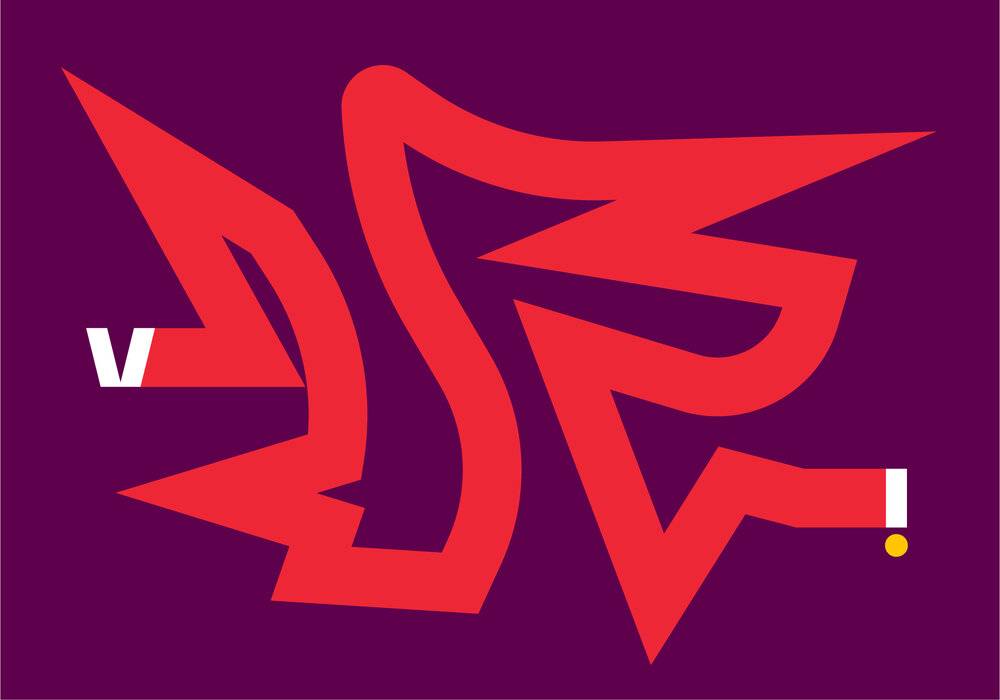
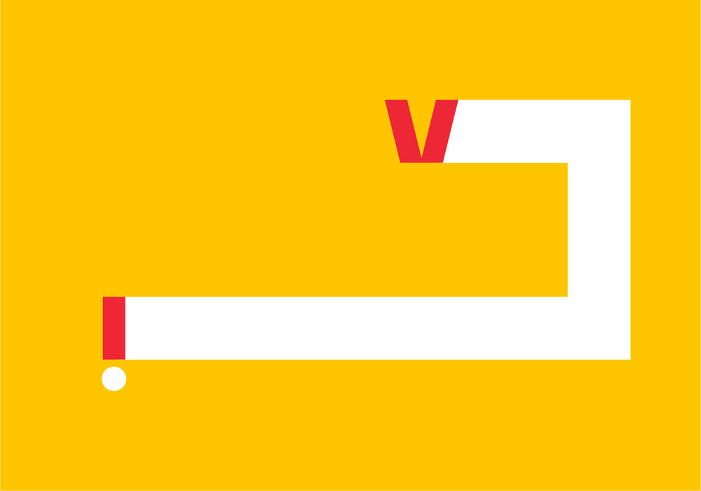
Trail
This is the most expressive of all expressions and is best suited for applications with motion or very little content.

Types of trails
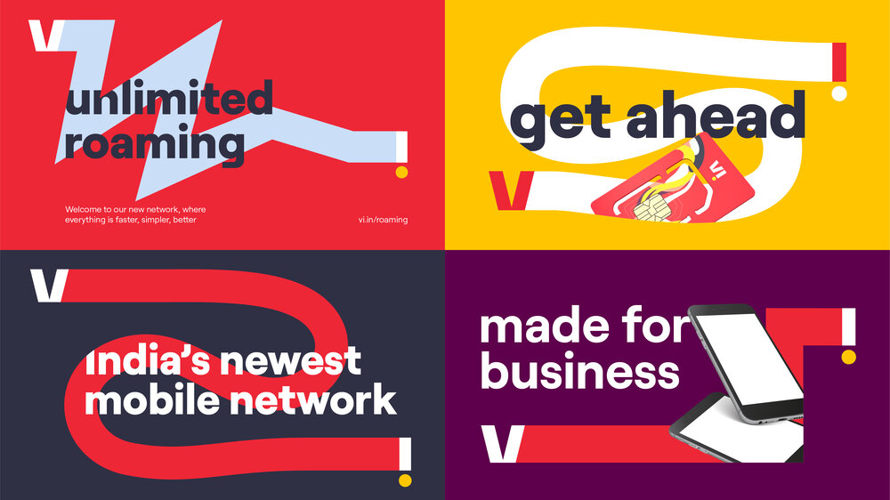

1. Graphic trails
Graphic trails allow us to accommodate more content than the illustrative option and can be used in situations where the focus is on messaging rather than the trail.
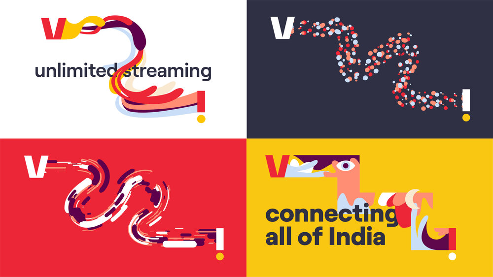

2. Illustrative trails
Illustrative trails allow us to create real impact. These trails should use abstract illustrations (see illustration section for more guidance) and are a great way to bring some brand personality to situations where we don’t necessarily have a message to convey.
Creating graphic trails
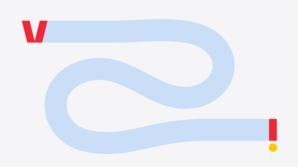
When creating trails, separate the two sides of the logo and connect them with a trail. It should always be equal to the height of the ‘V’ and consistent weight. Both parts of the logo must never be rotated to retain logo recognition.
The ‘V’ should always sit somewhere on the left-hand side of the layout and the ‘i’ on the right.
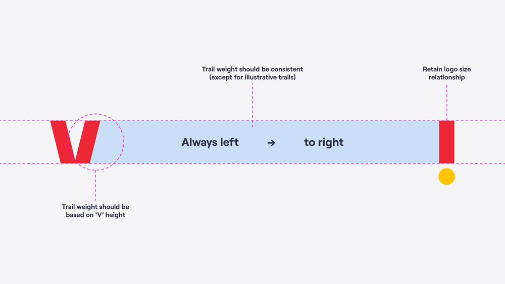

Flexibility
Our graphic trails can be fluid or angular. Be careful not to create corners that are too sharp, this can create an aggressive tone which should be avoided.
Our trails should also not be overly detailed with a maximum of four major corners on angular trails and two bends on fluid trails.

Layering
Layering should be introduced when possible to continue building a sense of space that helps feel like the logo has actually opened up. This should be attempted with both graphic and illustrative trails.
This shouldn’t be done if legibility is hindered.


Creating illustrative trails
Illustrative trails should follow all of the same rules as graphic trails, although they can use variable weights.
Refer to the illustration section for more guidance around creating these illustrations.

Using trails
Best suited to designs with a small amount of content that needs to make an impact through energy and richness – think large formats featuring a single message.

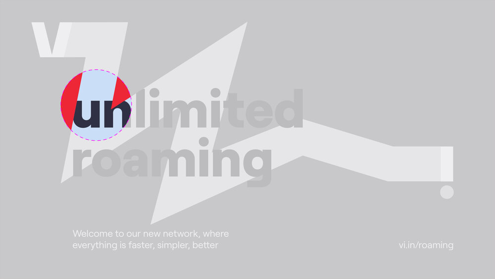
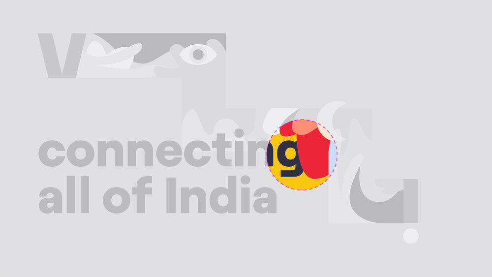
Crop
Our most flexible expression and best suited for compositions with more than just a headline.


Types of crops

1. Graphic crop
These crops are made by using graphic trails as super-graphics. These allow us to accommodate large amounts of content and quickly bring a touch of brand personality to small or tighter formats.

2. Window crop
Window crops are built from graphic crops and can be used to house images or illustrations to bring another level of life to the layout.

3. Illustrative crop
These are built by using illustrative trails as super-graphics and can be used to bring energy and brand personality to layouts.
Creating crops
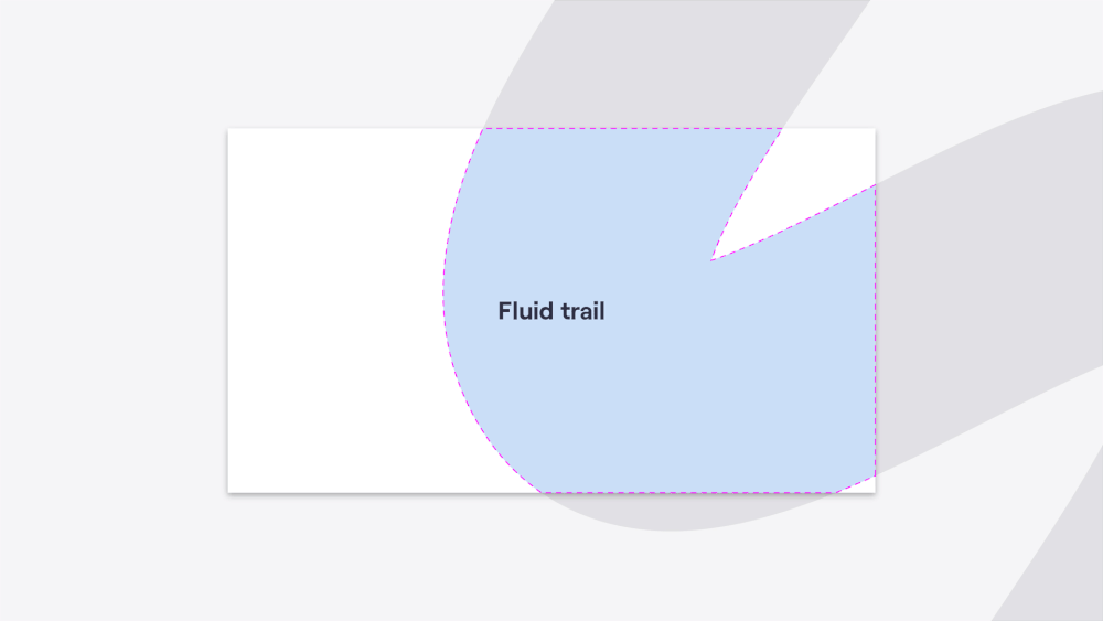
For graphic and window crops, we should always start with one of our master trails. There are two options – fluid and angular. These two trails are a great base and ensure good crops, avoid creating any new master trails.
They should be chosen based intended tone of the application. For example, when we want to be directive or include a call to action, we typically lead with the angular trail. Versus when we want to convey an emotive headline, we use the fluid trail.
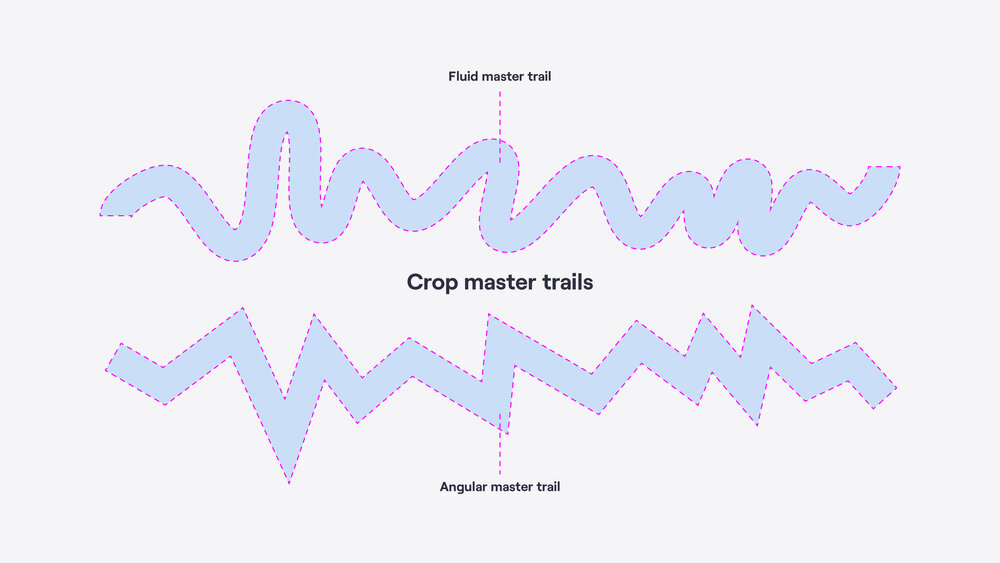

Creating graphic/window crops
When creating graphic/window crops, we should ensure that the trail has enough coverage so that images can be appropriately housed.
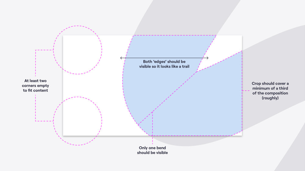
The crop shouldn’t take over the whole composition, make sure that at least two corners of the layout are free to accommodate our logo and any content. A minimum coverage of one-third of the layout (roughly) is a useful guide.
Always make sure both ‘edges’ of the trail are visible, so it looks like a trail and retains a connection to the rest of the brand. Ideally only one bend/corner of a trail would be visible per crop – depending on the format. This helps ensure that the crop is bold enough and not overcomplicated.


Layering
Layering should be introduced when possible to continue building a sense of space that helps feel like the brand/trail has actually opened up. This should be attempted with both imagery, text and illustrative trails.
This shouldn’t be done if legibility is hindered.


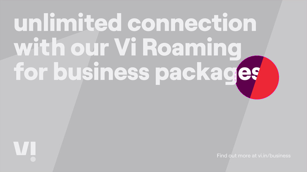

Using crops
Best suited for applications that need to convey a certain level of information but still need to feel Vi – think posters featuring and detailing new offers.

Pattern
Our brand should be focused on energy and bold confidence, but there may be rare situations where we need to appear slightly more reserved and/or premium. For example, on notebooks, retail bags or wrapping paper.
It is built from elements of our logo so care should be taken to use the pattern only as shown to ensure that the strength of our logo isn’t being diluted. The pattern should be used very sparingly.
Please note that this is the only time that elements of our logo can be altered.


Crimson pattern
Background — 100% Crimson
Pattern — 85% Crimson tint


Aubergine pattern (for business use)
Background — 100% Aubergine
Pattern — 90% Aubergine tint
Don’ts

× Don't rotate elements of the logo in any expressions.


× Don't overlap trails over themselves.

× Don't create trails that are too complicated, contain too many bends/corners or use elements of fluid and angular trails.


× Don't use trails as windows to hold images.

× Don't use crops that don't have an approximate coverage of one-third of the composition.


× Don't break photography usage rules e.g. over-stylised or cutout people imagery.

× Don't use trails without the opened logo at the ends.


× Don't use expressions within expressions e.g. illustrative trails within crops.

× Don't use one brand expression across every communication, ensure that a mix is used.


× Don't have any of the logo visible when cropping into trails.

× Don't create short, stumpy trails to force them into a format or to use as a window.

× Don't fold trails back on themselves or create trails where the 'V' is further right than the 'i'.
Things to remember:
01 Crop expressions are built from graphic trails
02 Ensure a variety of expressions and styles are being used across brand applications
03 Pattern should be used sparingly
