
Our illustration adds a layer of energy and dynamism to our designs.
What's on this page:
Our illustration style
Our illustration style builds on the flat graphic style of our logo and our brand principles. Simple shapes, clean lines and limited colours make our illustrations easy to digest and most importantly, easy to create and work with.
Illustrations should be used for applications where we want to convey a strong sense of energy and make an impact. For applications with a lot of content, illustrations should be avoided to not overwhelm the design and confuse the message.
This section explains how to approach creating illustrations. If you need to know more about layouts or brand expressions, please refer to the layout section or brand expression section.
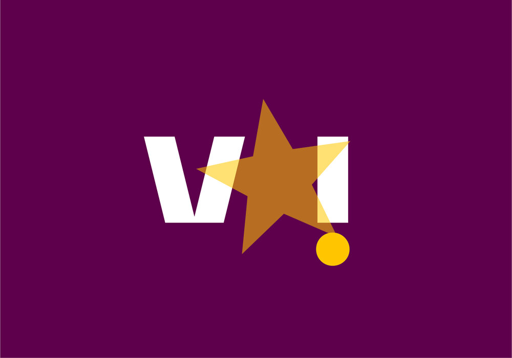
Types of illustrations
Our brand illustrations can be segmented into three main types. Although each type follows the same overarching brand illustration style, each has a set of slightly different rules to ensure they work in their environment.
Note that this doesn’t include any other illustrations that fall outside our brand system but may be necessary for certain situations such as specific promotional campaigns etc.


Trail
Our trail illustrations are our most expressive form and should predominantly be abstract to avoid overwhelming compositions.
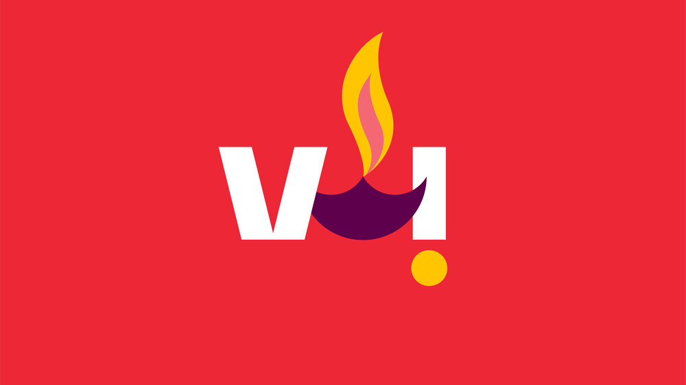
Frame
Our frame expressions can use illustrations to depict specific holiday, or events etc. These should be slightly more literal than our trail illustrations to get across the intended message.


Iconography
This is where our illustration style is at its most literal to clearly convey the purpose of the functionality of the icons. It closely references the forms of our typeface and logo.
Illustration palette
Our illustration palette consists of our core brand palette and our tints with the opportunity to add in any additional colours needed. Other colours shouldn’t have more than 25% prominence to ensure that our illustrations are always clearly Vi.
See our colour section for more colour guidance and colour values.
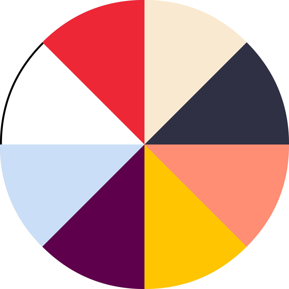
Brand palette
Our brand palette colours should always be the lead colours of our illustrations to ensure they are clearly Vi. Ideally, they would be at least 50% of our brand palette. All illustrations should begin with these colours before adding any others.
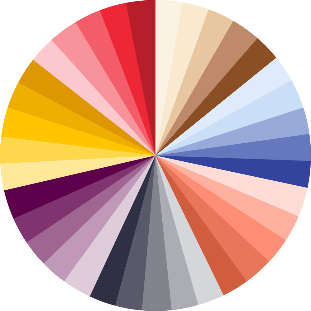

Tint palette
Our tints can be used to support our brand palette and allow us to create tone and variation easily. Only add if necessary.
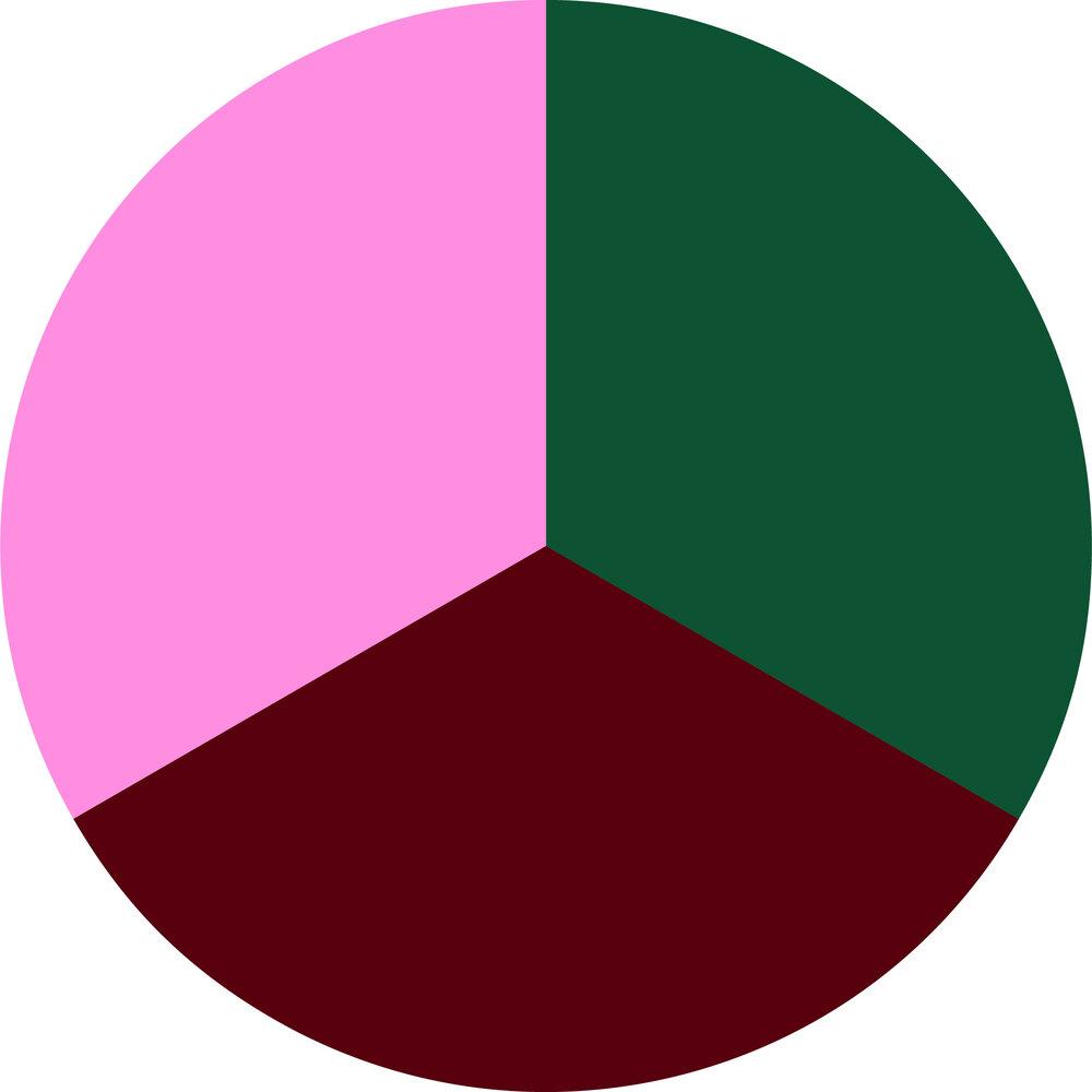

Additional colours
Any additional colours may be used in illustrations that require specific colours not covered by our brand palette (e.g. pink, green, brown etc.). These should never have more than 25% coverage to retain a brand presence. Using additional colours should be avoided when possible as our illustration style is more abstract than realistic.
Guidance
Use this guidance to inform all illustrations created or sourced.
Graphic and abstract
Use simple, graphic flat forms; no outlines or 3d effects. Our illustrations should always attempt to be abstract to bring energy and expression to compositions and let our copy do the talking.
Energy
Illustrations are used in situations where we want to bring expression and impact, so our illustrations should always be full of life. Using our full brand palette helps with this and introducing motion where possible amplifies this.
Depth
Our illustrations should have a sense of depth through layering. This helps create a sense of space to feel like our logo has actually opened up. Layering also helps us generate interaction between other elements in our composition.
Colour
Our illustrations should be lead with the colours from our brand palette with tints added if necessary and any additional colours used to a small degree if absolutely necessary.
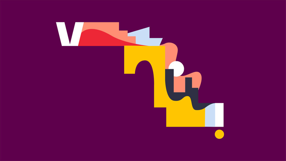
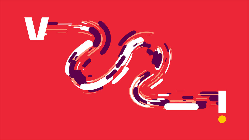
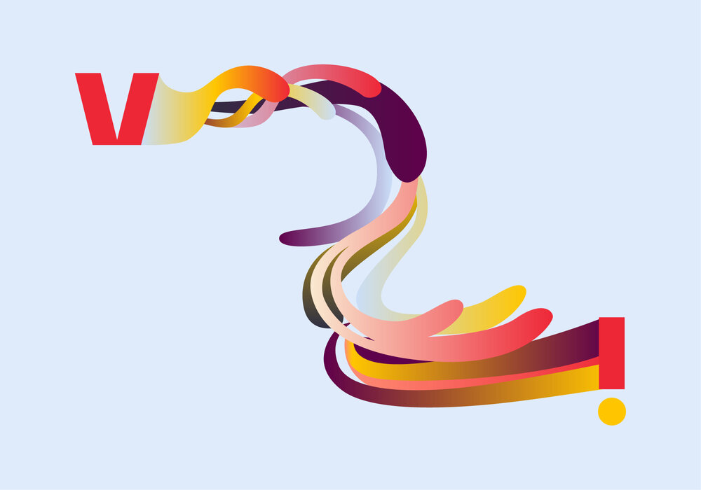
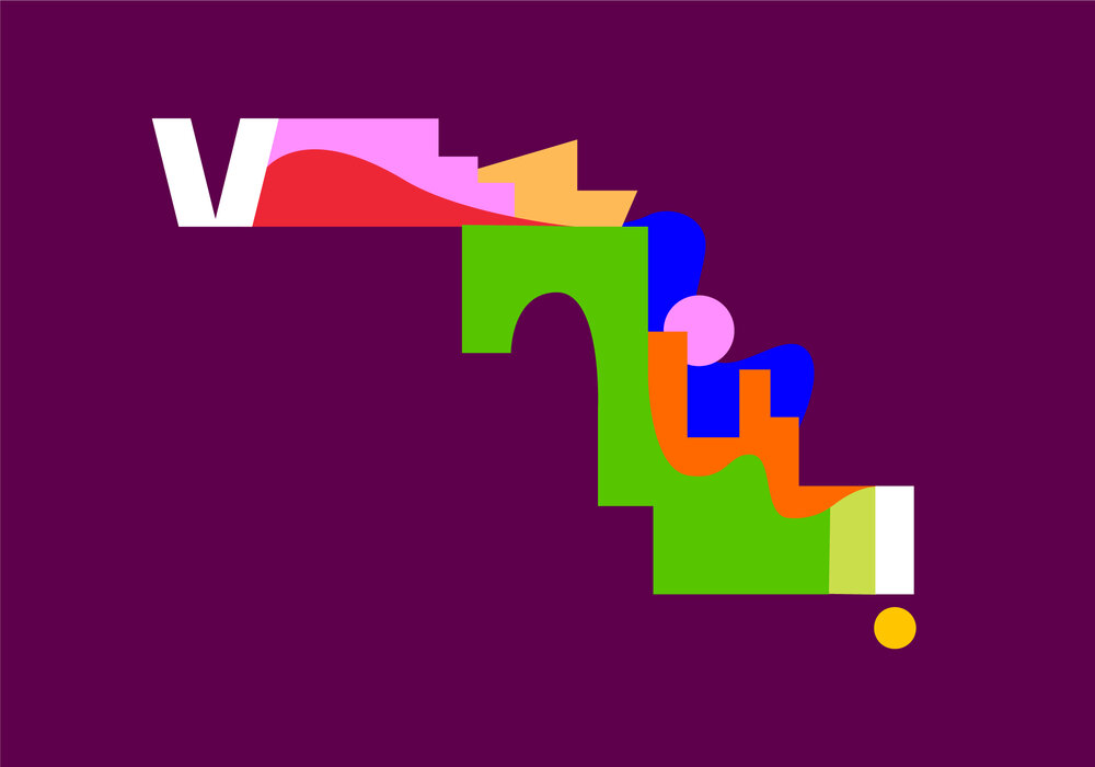
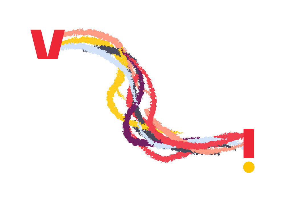
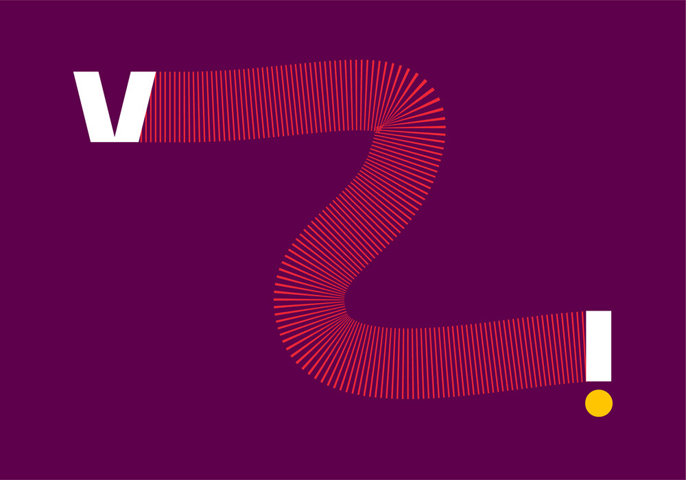
Trail illustrations
The trail expression is highly flexible and lends itself to illustration well. These illustrations should be expressive, abstract and energetic. They are most effective when in motion, so we encourage doing so when possible. Our trail illustrations help amplify the personality and diversity of the Vi brand.
Illustrative trail expressions present us with an excellent opportunity to make the brand feel more open and encourage participation. When possible, collaborate with local artists to create trails that can be added to the Vi trail library.
Guidance on using these illustration layouts using this expression is detailed in the System section →
Weight
The trail should always attempt to start and end with roughly the same weight as the logo that it’s joining. This may not always be possible in motion.
The middle sections of the illustrative trail are encouraged to be thicker, narrower or partly transparent to create variation and separate from the graphic trails (see brand expressions section).


Depth
Creating depth is encouraged as it helps to amplify the spacial quality of the brand to make it feel more open and welcoming. Please note that shadow, gradients and other lighting effects should never be used – depth can be implied simply through scale and layering.
A level of layering is essential to interact with other elements in the composition, such as text.

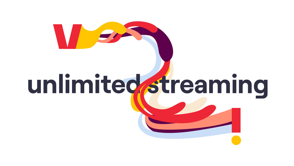
Messaging
When creating illustrative trails, it may be possible to create a link to, and further strengthen, the message of the application.
For example, the poster to the right utilises a very fluid, full trail to strengthen the message of ‘unlimited streaming’.

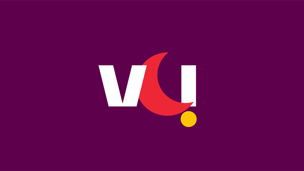
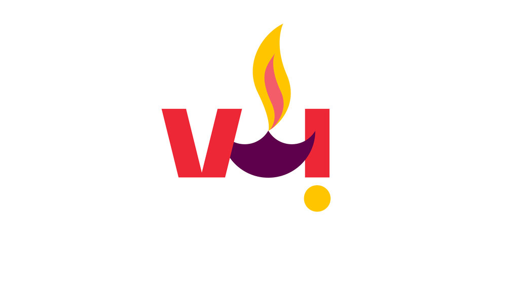
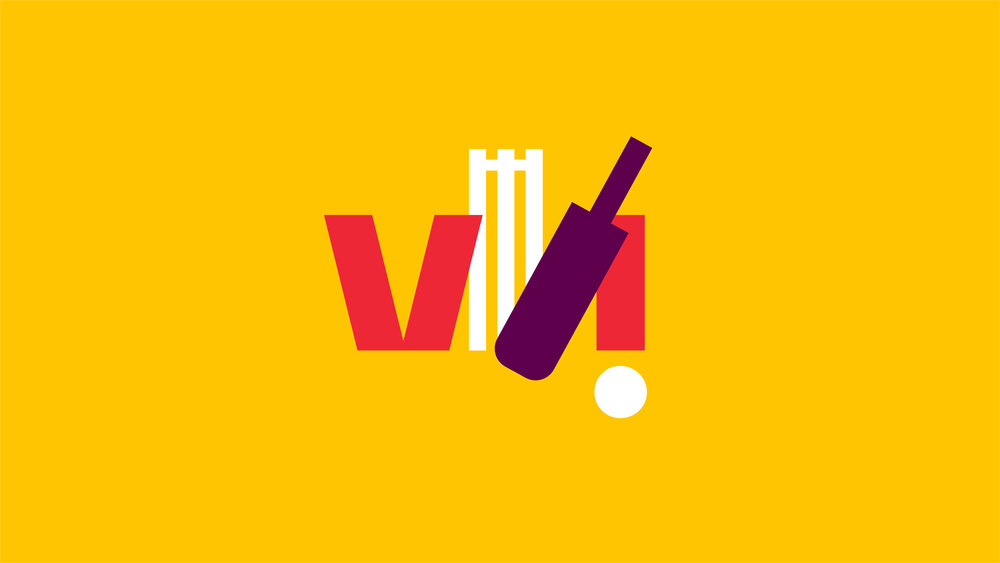
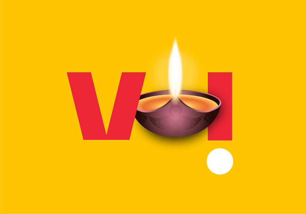
Frame illustrations
Our frame brand expression can be used to feature standalone illustrations. This can be a useful way to highlight holiday, events, sports etc. These illustrations should be more literal than our trail illustrations to get across the intended message but should still retain a sense of abstraction.
Due to their size and the way they sit within our logo, these illustrations should be straightforward and balance being abstract and recognisable.
More guidance on creating and working with this expression can be found in the brand expression section.

Harmony
Our frame expression illustrations sit within our logo, so should feel like they belong rather than overwhelming and distracting from our logo. When creating frame illustrations, attempt to achieve harmony through simplicity and scale that roughly matches our logo.


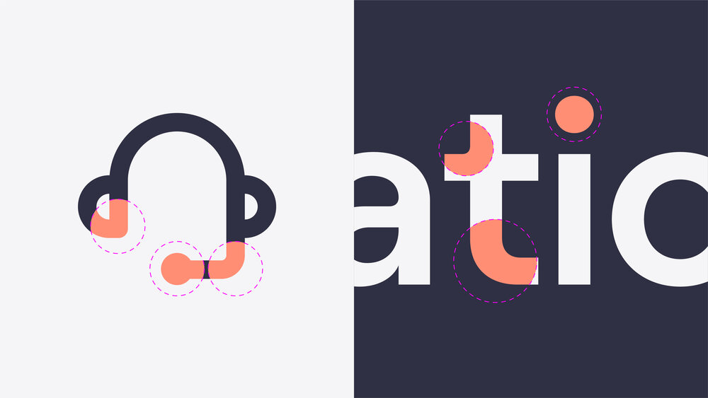
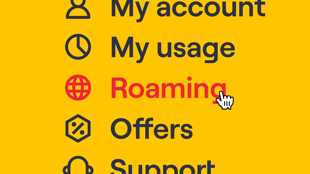
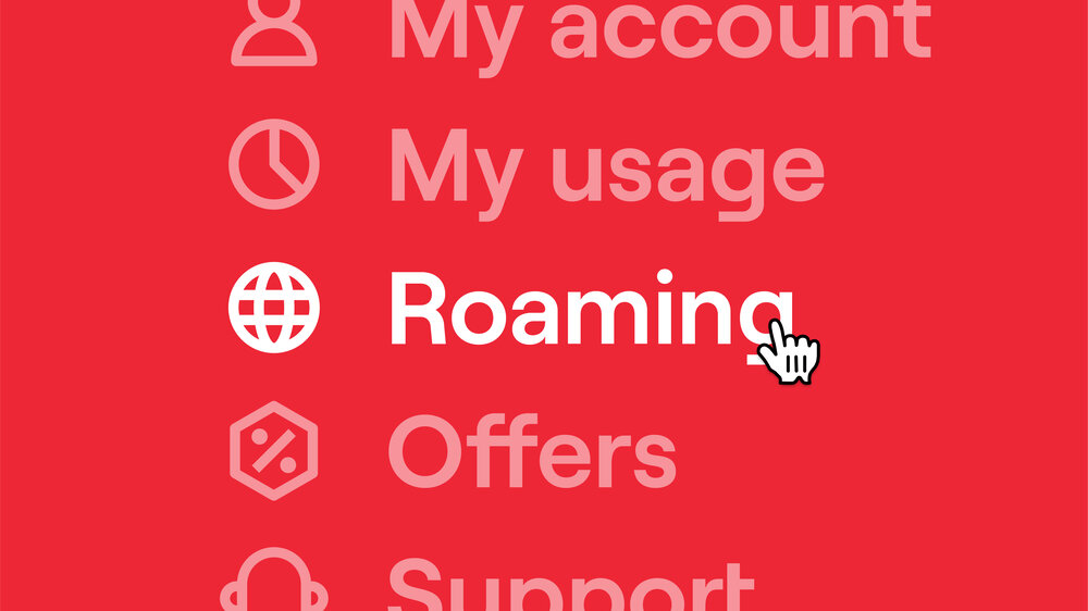
Iconography
Due to the need for functionality, it can be difficult to capture our illustration style in iconography. For this reason, we take inspiration from the forms of our brand typeface and logo instead.
Here are some examples of potential iconography.

Form
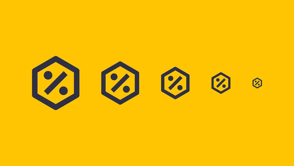
Our iconography should always be created from heavy, solid lines to reference the heavy forms of our logo and the weights of our headlines. This helps our iconography sit seamlessly with accompanying labels in UI.
Our iconography should feel like part of a set so ensure that every design follows the same defined stroke weight and grid.
Always test iconography at very small scales to ensure that there isn’t too much detail that begins to blend together.


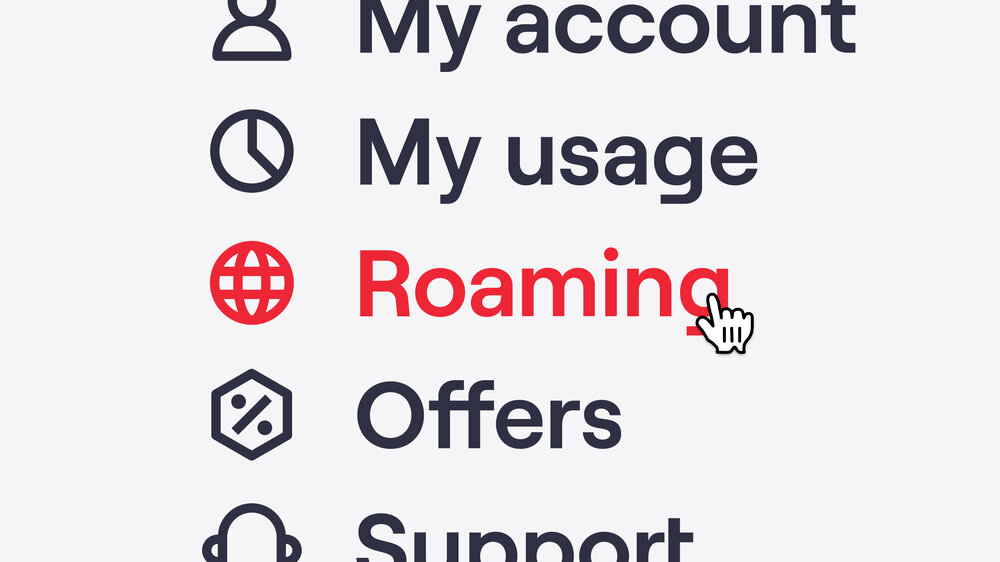
States
Due to the thick line weight of our icons, we can easily indicate different states through simple colour changes.
Always test the legibility of colour combinations at the chosen scale first. Tints can be used to dull non-highlighted options if highlight colours aren’t legible.


Don’ts

× Don't use overly detailed illustrations or illustrations that use shadows etc.

× Don't use gradients.

× Don't use blend modes or transparencies.

× Don't use too many additional colours or to too high a percentage.


× Don't create trails that are too literal or use them in a way that is too literal.


× Don't create icons that are too abstract or over-embelished.

× Don't use textures like paint/hand-drawn effects.

× Don't use fine, delicate lines. Our style is bold and solid.


× Don't create fill icons.
Things to remember:
01 Trail illustrations should be somewhat abstract
02 Illustrations should always be made up of flat, graphic forms
03 Additional colours may be used in small doses (no more than 25% coverage)
