
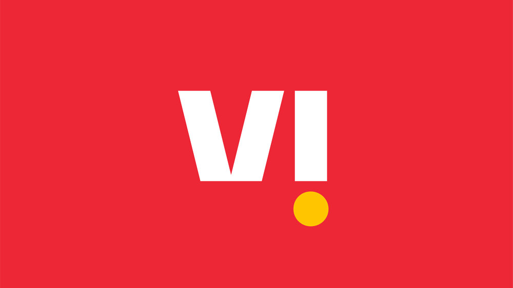
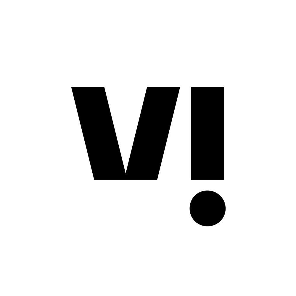
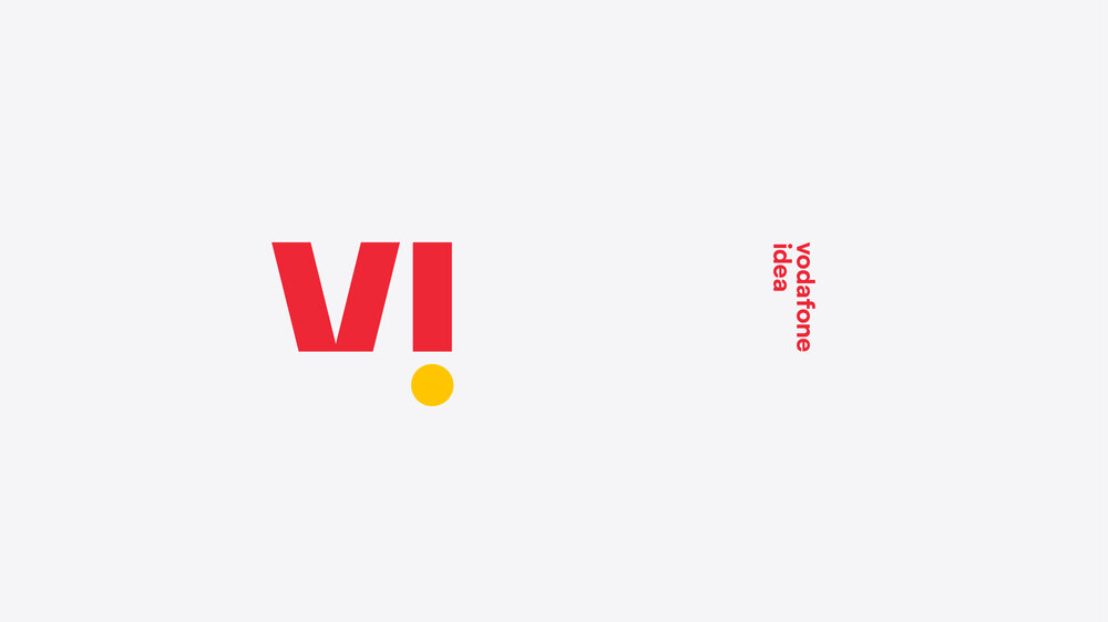
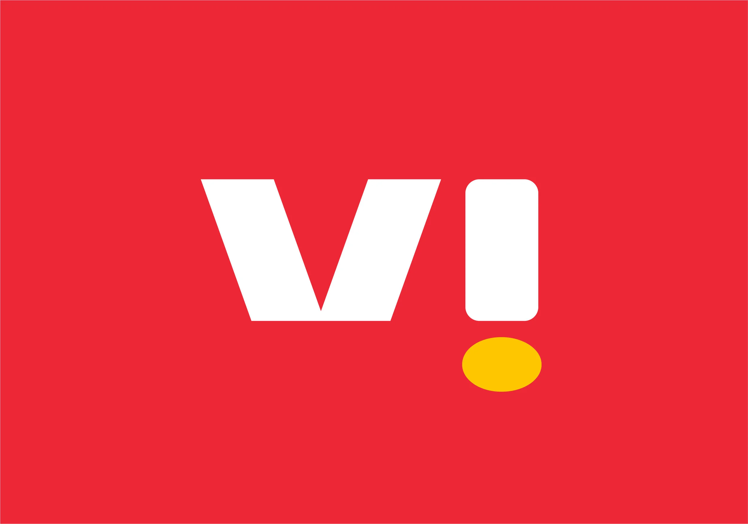
Our logo represents a brand that is bold and confident.
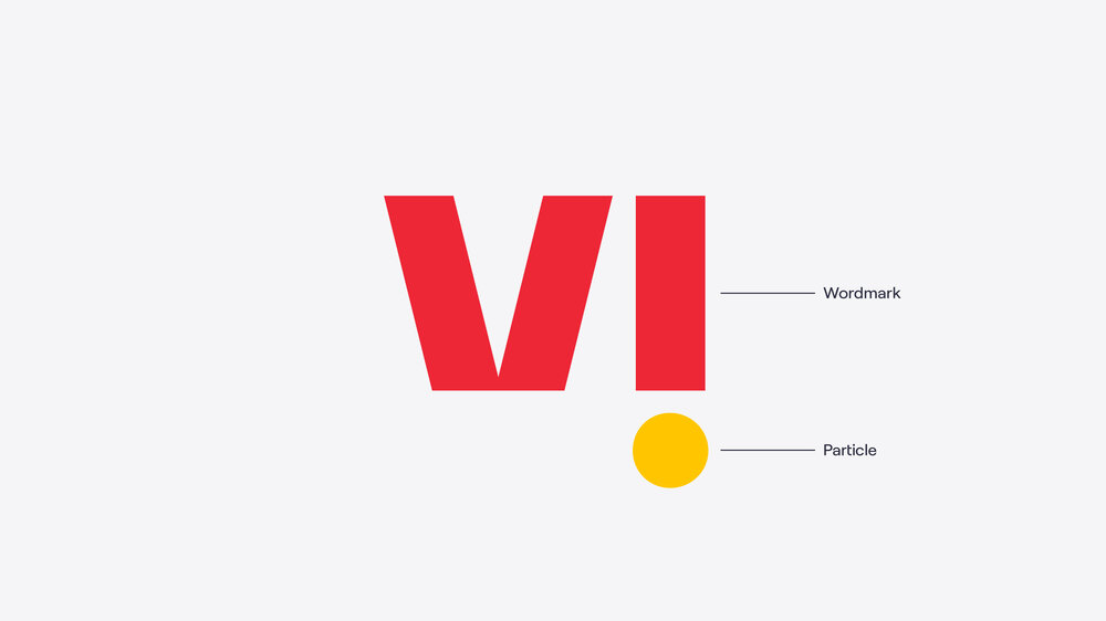
Our logo
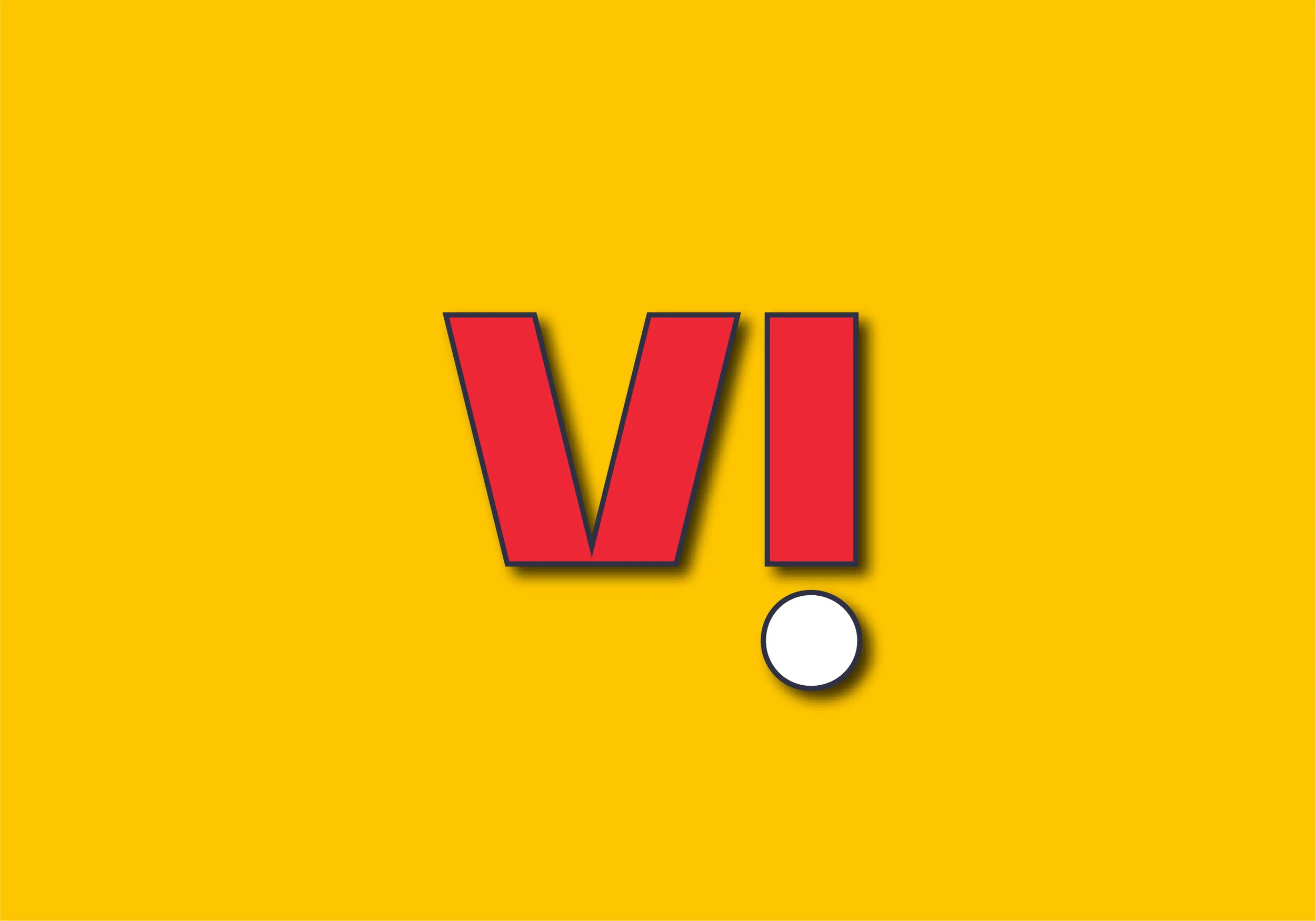
The Vi logo is bold, simple, and always appears in two colours to ensure standout.
Our wordmark forms are strong, representing the reliability of a united Vodafone and Idea and the confidence of a connected India.
Our logo features an ‘i’ punctuated with a bold, confident particle to bring surprise and delight.
How you write ‘Vi’
We write Vi in lower case with a capital ‘V’. The capitalisation demarcates Vi as a proper noun within written communications. We don’t use an exclamation mark when writing Vi (as with the logo) as this symbol isn’t used in Indic scripts and can’t be easily transliterated.
Vi can be transliterated into local script where necessary.
How you say ‘Vi’
We say Vi by biting our ‘V’ and rolling our ‘i’. Vi rhymes with ‘we’ but is pronounced with a ‘v’ instead of a ‘w’.
To hear how to pronounce Vi, click on the audio file below.
Colour
Our logo comes in three two-colour combinations and one full-white version. These have been created to allow flexibility within the brand system, so that the most appropriate variation can be used on any given background colour.
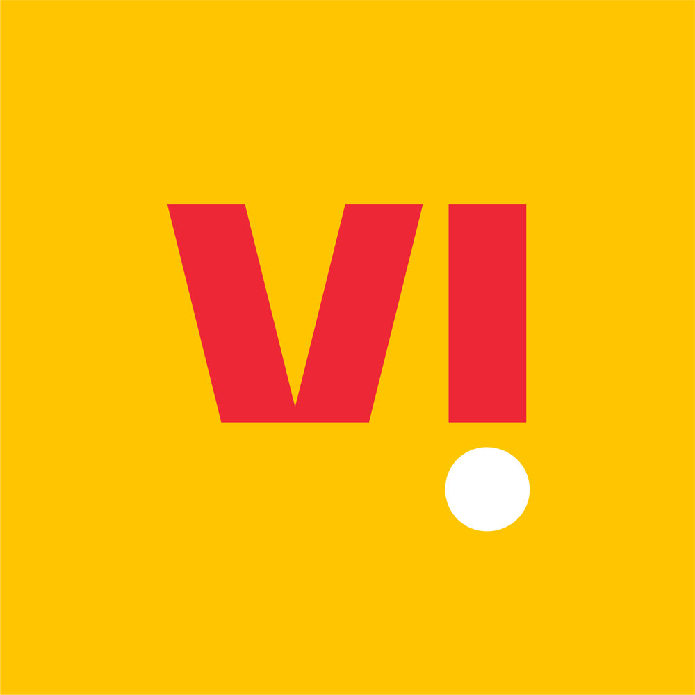
We have four colour variations of the logo
These are the only colour variations of the logo. Please do not create new versions. The preference is always for our logo on a white or Crimson background, so as to retain a Mustard particle and a high proportion of Crimson.
Primary variations
Our logo on a white or Crimson background. We should attempt to use these options wherever possible, so as to retain the presence of our Mustard particle and a high proportion of Crimson.
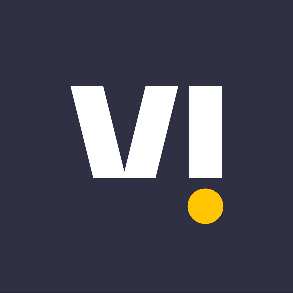
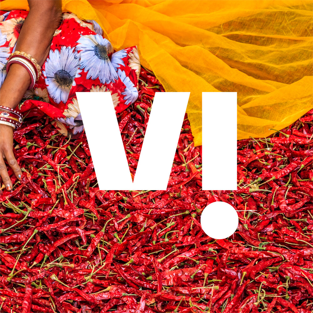
Secondary variations
Our logo on Mustard, Slate or imagery backgrounds. These should be used less frequently than the primary variations. When placing our full white logo on imagery, ensure that it is placed on a fairly clear, not too light portion of the image.
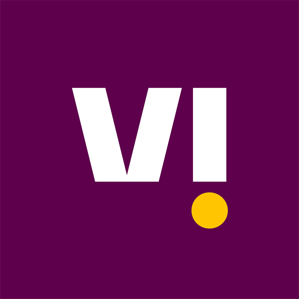
Business variation
Our logo on an Aubergine background.
This should be used solely for business applications.
Monotone variations
Our logo in full black or full white.
These should only be used in situations where a monotone logo is required (e.g. sponsorship requests). Note that the full white version is the same as for imagery backgrounds.
Motion
We use our logo to initiate motion in our brand and bring our brand expressions to life. Motion also helps visualise our brand positioning of helping you get ahead by demonstrating how Vi opens up to put customers and their needs at the heart of our brand.
All animations should begin with our logo opening up, and should include the Mustard particle as a playful element of surprise. The particle always swings up to 'unlock' the logo before opening and swings back into place after content is revealed. This prepares the viewer for the quick and energetic reveal and punctuates the end of the trail.
For guidance on how our logo can come to life with trails and images refer to the system section, and for more advice on our motion behaviours see the motion section.
How we sound
We have created a sonic trail to accompany the endframe. It captures the confidence and energy of the particle and helps us to build a fuller and more immersive brand experience.
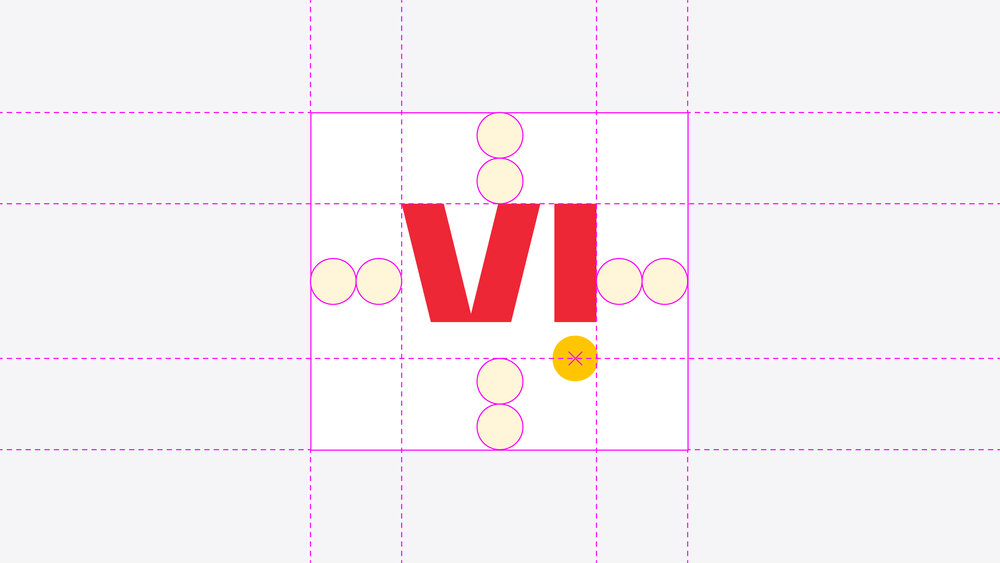
Clearspace
Clearspace is essential to ensure that our logo has sufficient standout and is never lost in the design. Our logo should have a clearspace of two particles all around. Note that the bottom two particle clearspace aligns to the middle of the logo’s particle to account for the large amount of whitespace under the ‘V’.
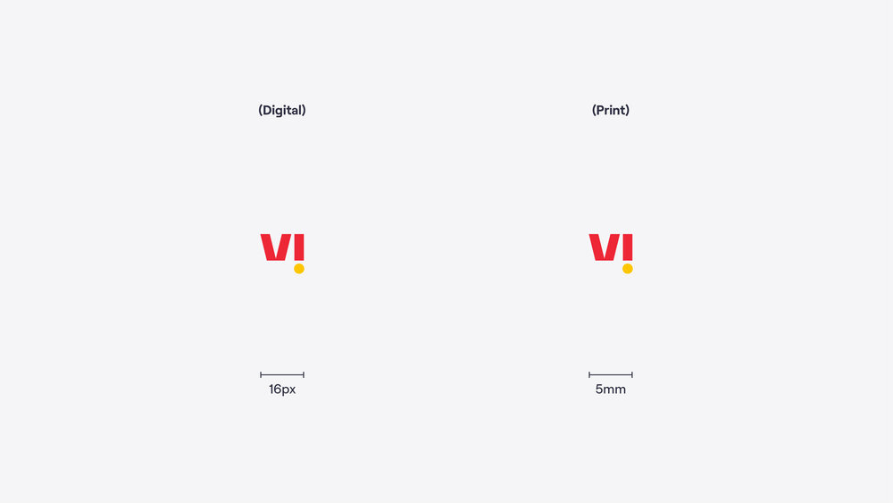
Minimum size
Honouring minimum size is essential to legibility. Our logo shouldn’t ever be smaller than the specified minimum sizes listed here. These are absolute minimum sizes and should not be treated as merely recommended sizes.
Always test the logo with the necessary colours and printing methods etc. when using at an extremely small scale.
Note that the minimum size is different for print and digital use.
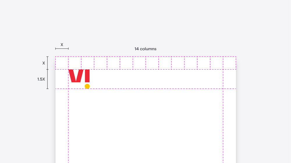
Placement
Please refer to this guide when placing our logo within a layout. For more guidance see the layout section.


Lockups
There are three situations in which our logo would be locked up with another element. Follow this guidance to ensure that all elements are balanced correctly.
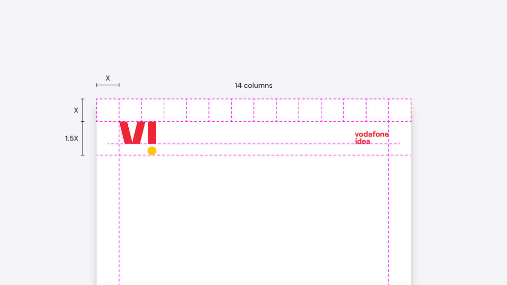
Heritage (attached)
For when we want to highlight our Vodafone and Idea origins and draw on our heritage. This would be used mainly during the launch of the rebrand and would eventually be phased out. Avoid using this on anything that isn’t easy to update/replace (signage, etc.). This is best for extreme sizes or content-heavy compositions (where the ‘vodafone idea’ element in the detached heritage scenario might get lost).
Heritage (detached)
Used for the same reasons as the attached heritage lockup but distinguishes Vi as its own entity. This is our preferred heritage lockup as it avoids any confusion about whether Vi is merely an acronym.
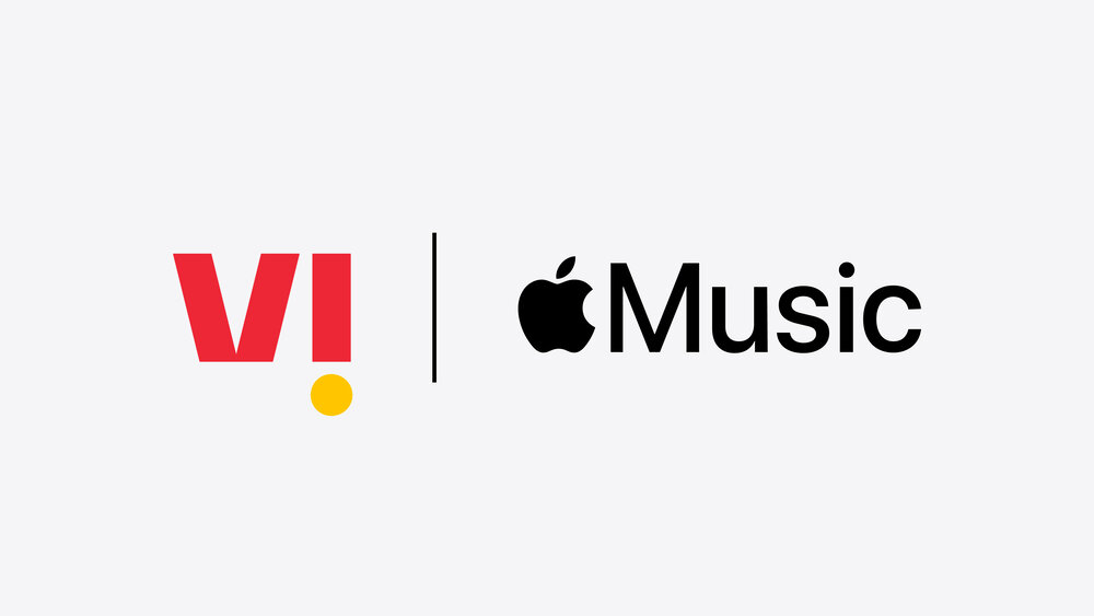
Partnership
For when we want to feature one of our many partners in a communication and highlight our relationship. The order should be informed by the partner and/or situation.
How to build attached heritage lockups
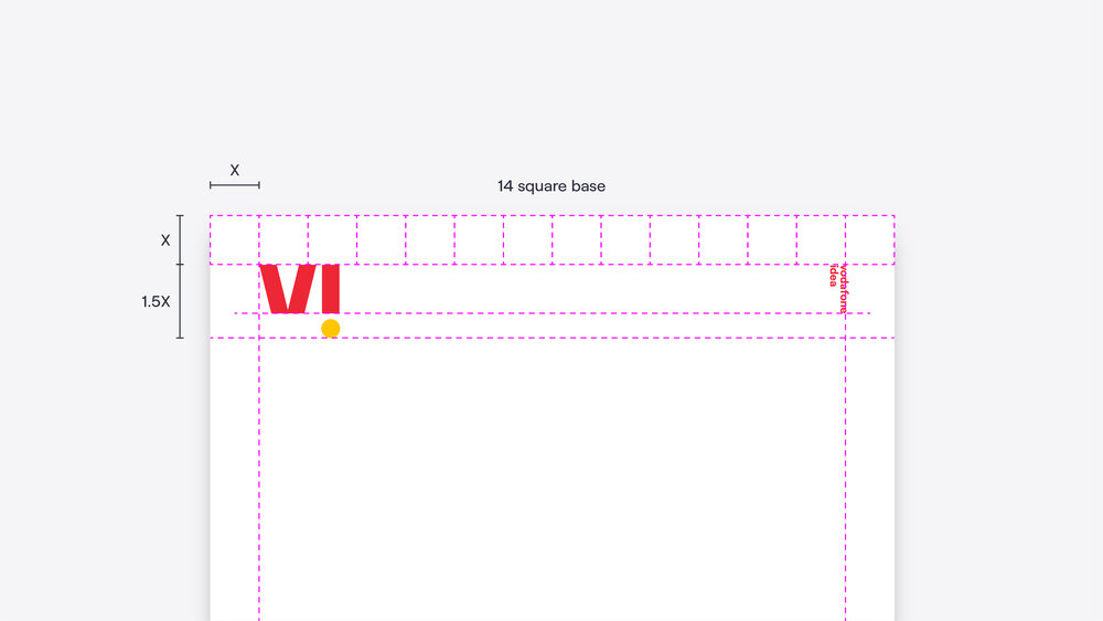
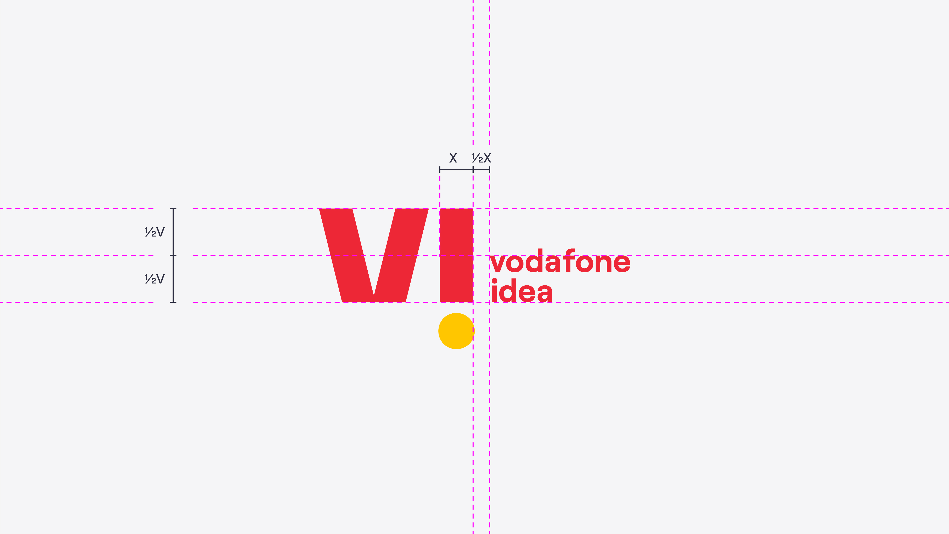
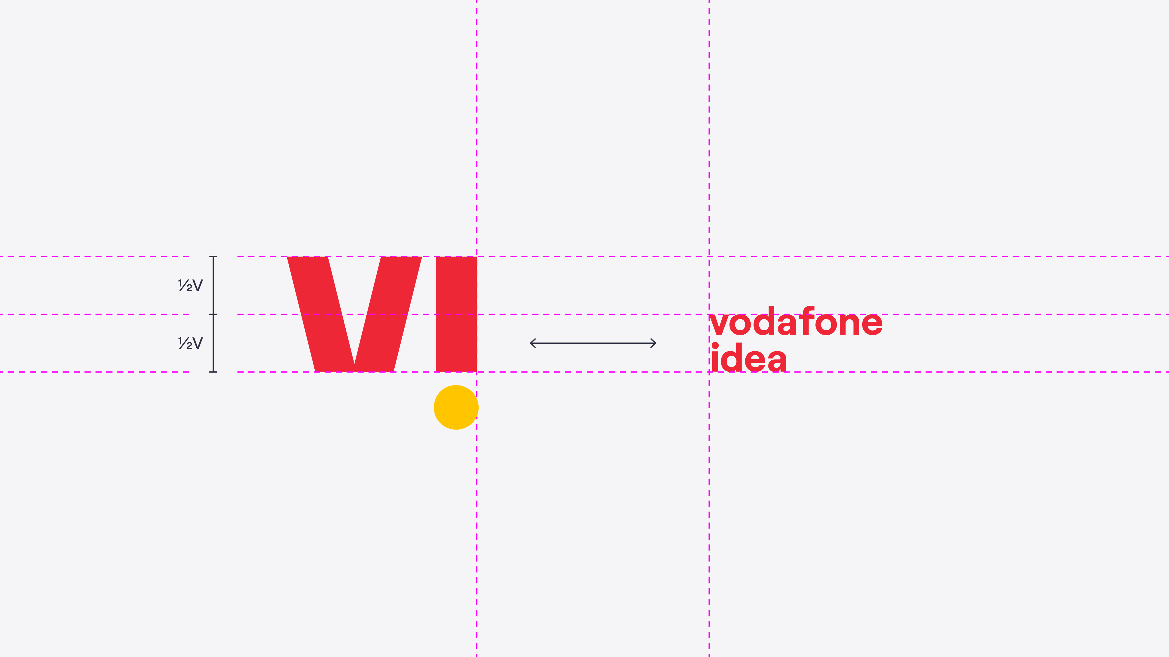
When creating attached heritage lockups, our logo and ‘vodafone idea’ should always be separated by the height of the ‘v’ from ‘vodafone idea’.
The colour of the ‘vodafone idea’ element should follow the colour of the wordmark of our logo – not the particle.
Horizontal or vertical lockups should be chosen based on what visually fits best in the layout.
Use the slider to reveal or hide the grids.
Horizontal
Vertical
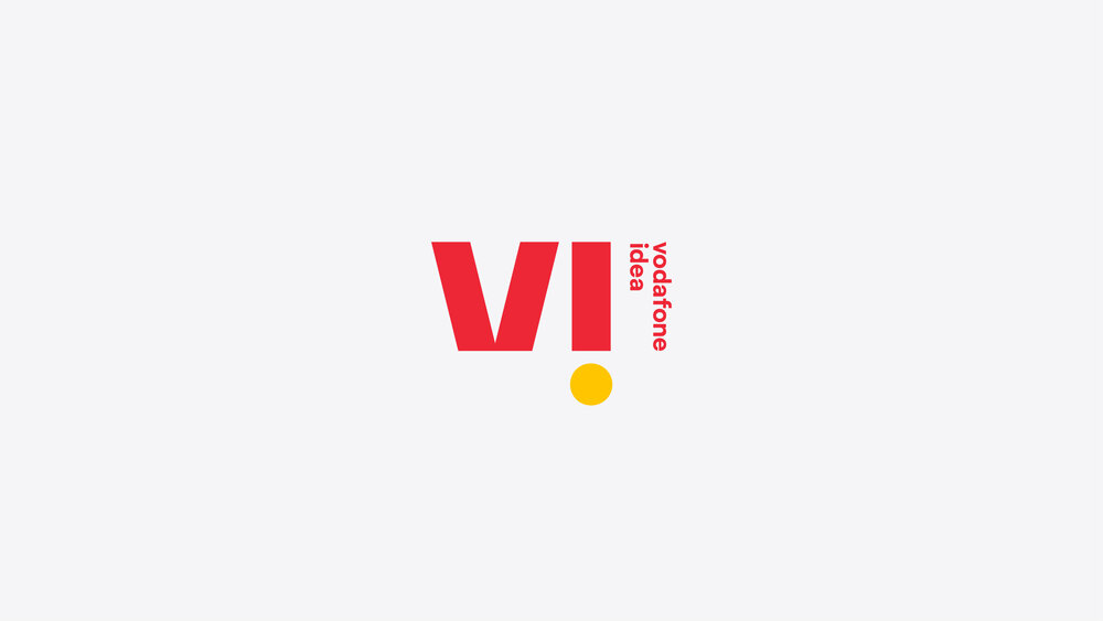
How to build detached heritage lockups
When using detached heritage lockups, our logo and ‘vodafone idea’ should be arranged in opposite corners. Vertical detached lockups will usually work best as the alignment of the ‘vodafone idea’ fits into corners better.
The colour of the ‘vodafone idea’ element should follow the colour of the wordmark of our logo – not the particle.
Use the slider to reveal or hide the grids.
Horizontal
Vertical
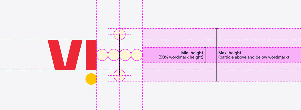
How to build our partnership lockups
Every logo is different, so there is no single formula for sizing partner logos in our partnership lockups.
As general guidance, the partner logo should be spaced two ‘particle’ widths away from the divider line with the bulk of the logo (for example the wordmark) horizontally aligned with our Crimson wordmark. The partner logo shouldn’t be more than a particle’s height larger than the top and bottom of our logo or less than 50% the height of our wordmark.
Refer to the examples below for some example lockups across a variety of different logos.
Always refer to the partner’s guidelines to ensure that our lockup’s clearspace etc. is sufficient for their logo.
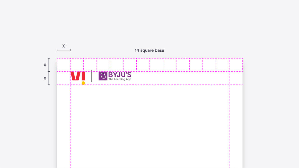
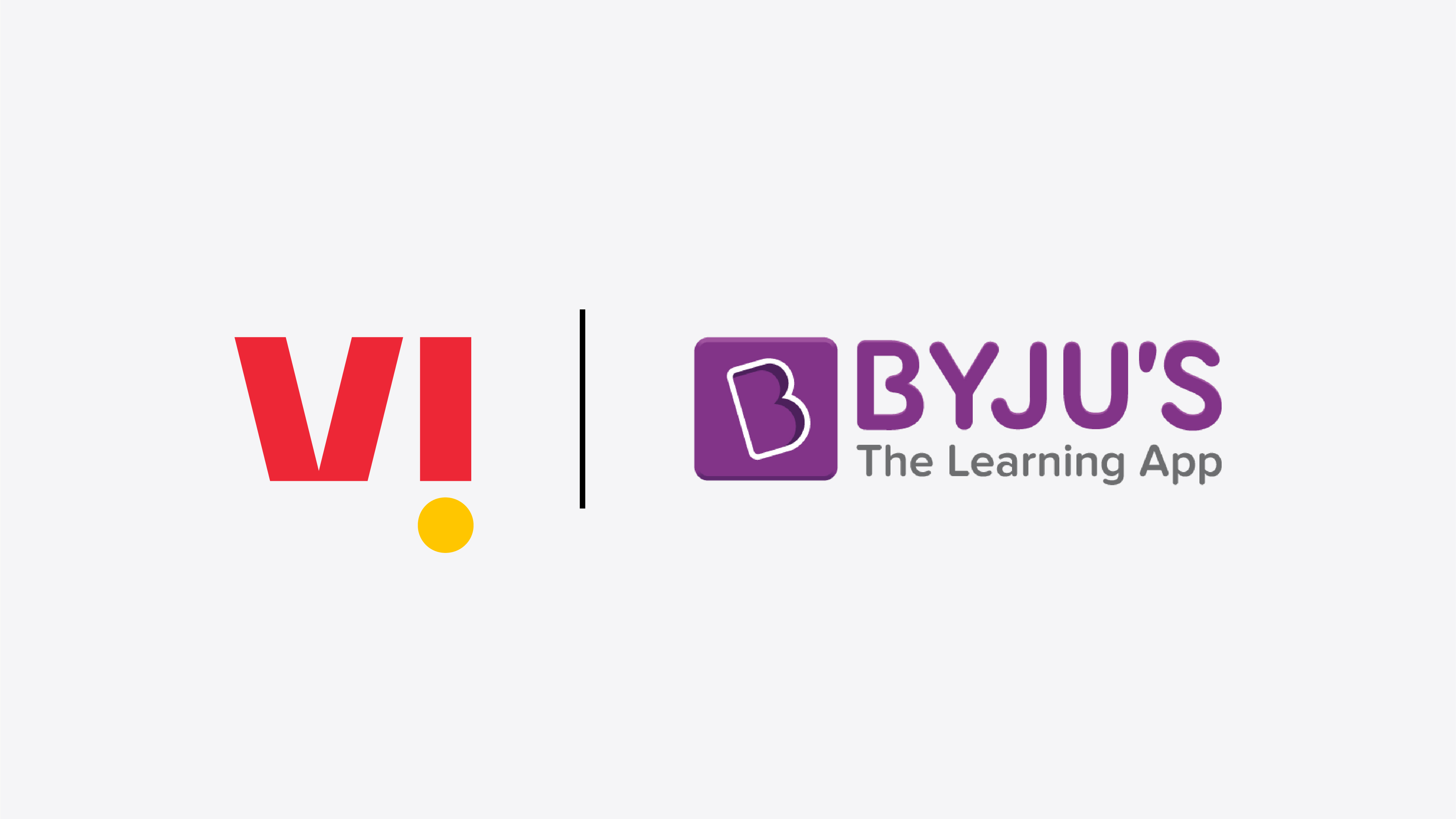
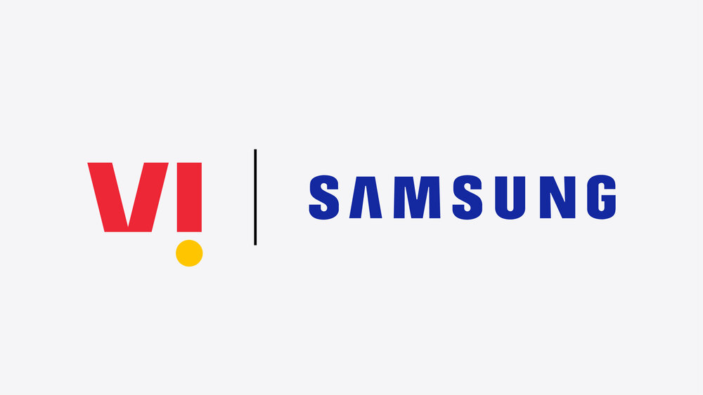
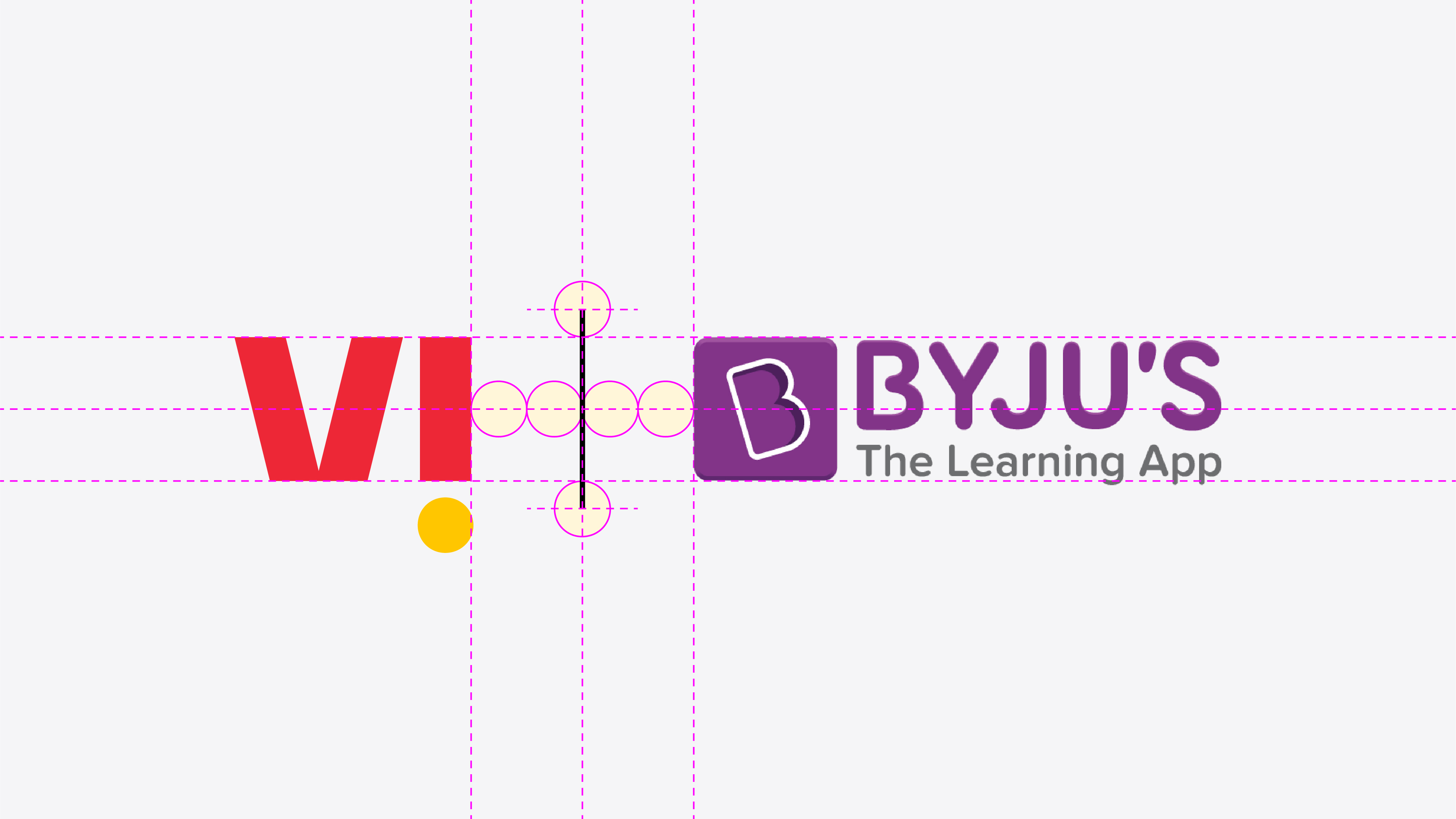
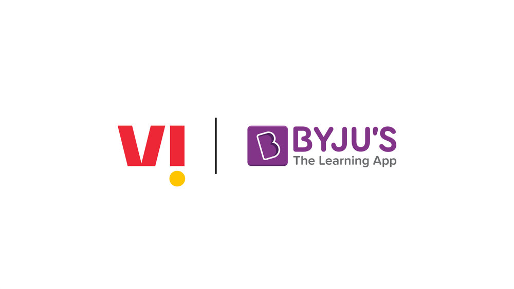
Example partnership lockups
Byju’s example:
The tile shape is the focus of the Byju logo, which works well as it is the same height as our Crimson wordmark.
Use the slider to reveal or hide the grids.
Byju's
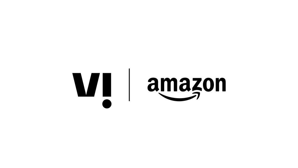
Amazon
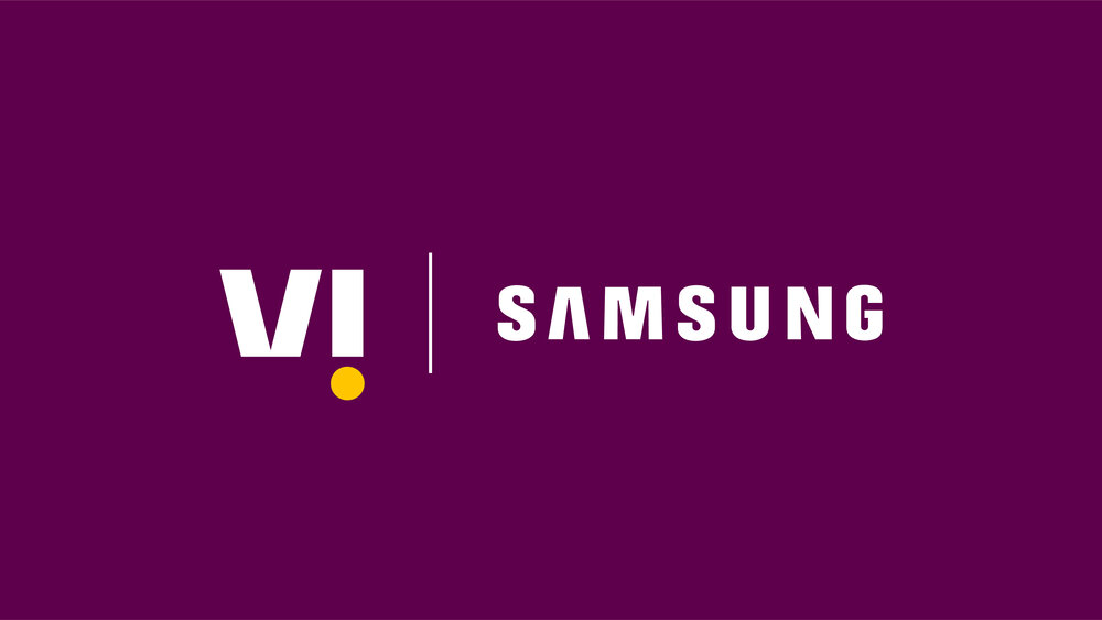
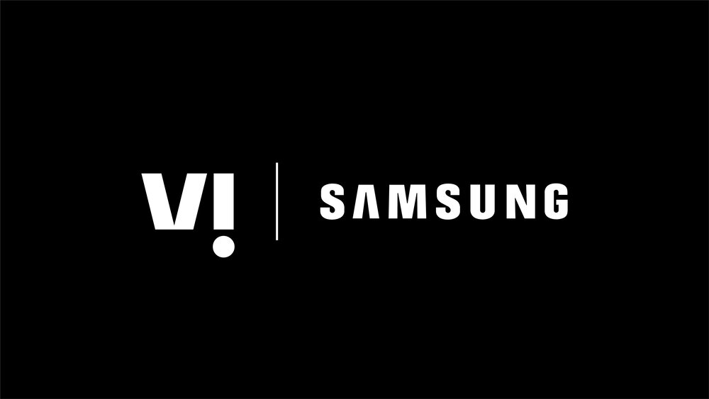
Samsung
Partnership in motion
Our partnerships are hugely important to our business and we call them out frequently. In situations where motion is possible (e.g. TV, social media, websites) we can present these relationships in a way that is more expressive.


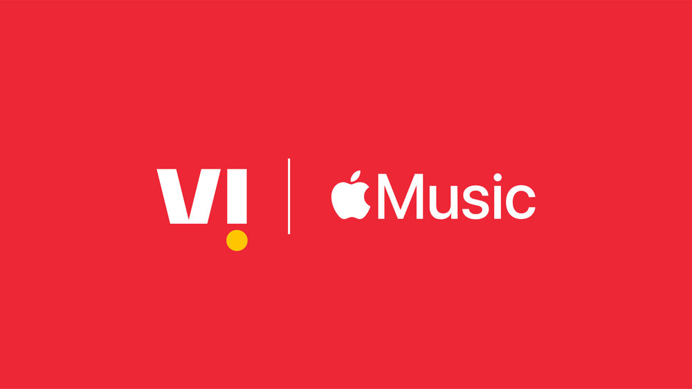
Partnership lockup colours
The colours of our partnership lockups depend entirely on the guidelines of the partner brand. We should always refer to our partners’ guidelines to ensure maximum legibility and correct representation of our partners’ identity systems. Below are some examples of colours that could work – these are purely examples and haven’t been created with any knowledge of the relevant brands’ guidelines.
The divider line between the two logos should always be black or white and its weight should not be altered from the partnership template file. For our own logo, only defined colour variations should be used (see the logo colour section above) and we should never apply our partners’ brand colours to our own logo or vice versa.
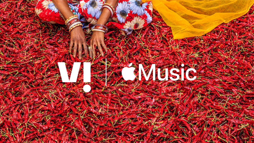
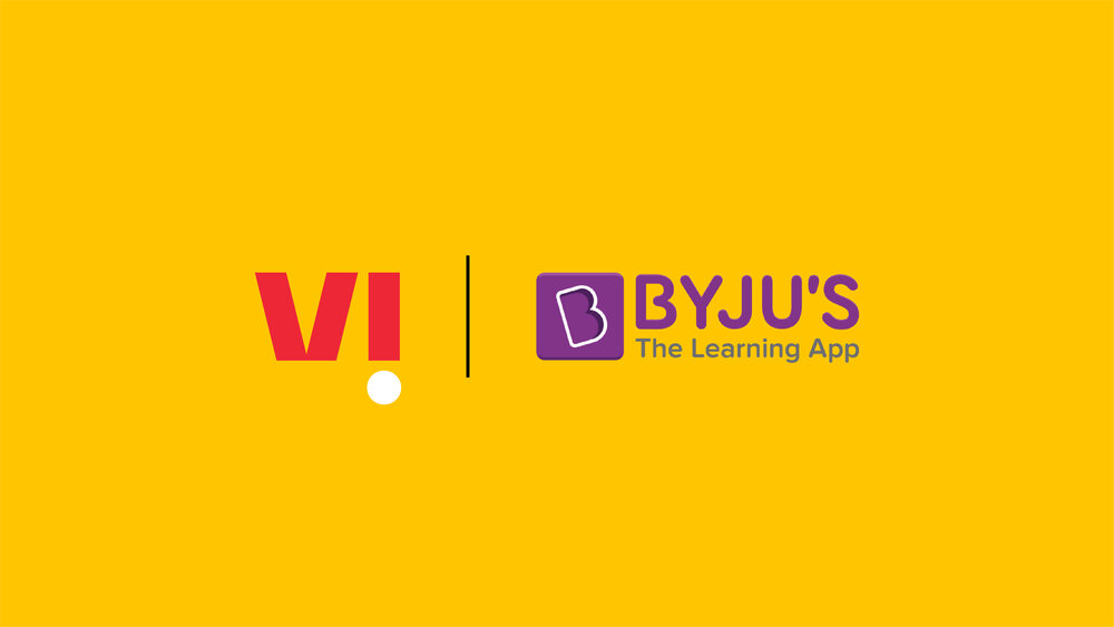
Brand colours
These examples show how different partner logos can work with our logo to respond to a variety of background colours from our brand palette. Always refer to partner guidelines as not every background may be possible for every partner brand – if in doubt use a white or Slate background.
Monotone
For situations that require monotone logos we should only use full white or full black (rather than Slate) – this is likely to be allowed by any partner brand.
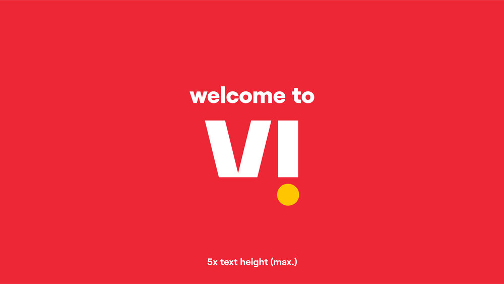
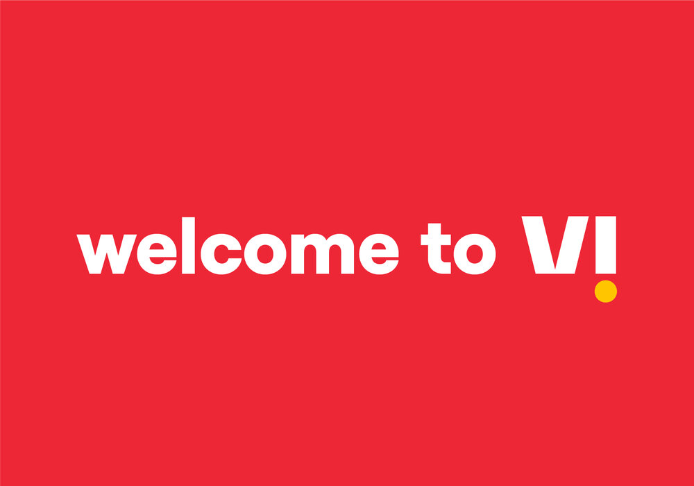
Using our logo with headlines
As a general rule, we should avoid using our logo in conjunction with text – ‘Vi’ should instead be written out in the brand typeface. However, in situations like the launch of the new brand, this may be necessary.
In these situations, we should follow the following guidance to ensure that this isn’t seen as a logo lockup and that the strength of our logo is retained:
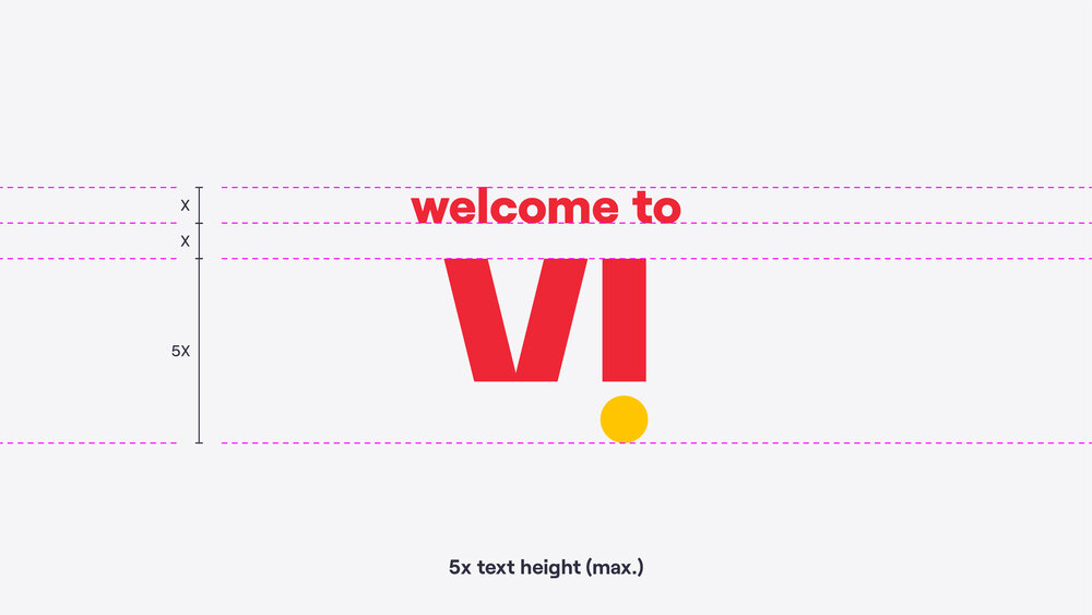
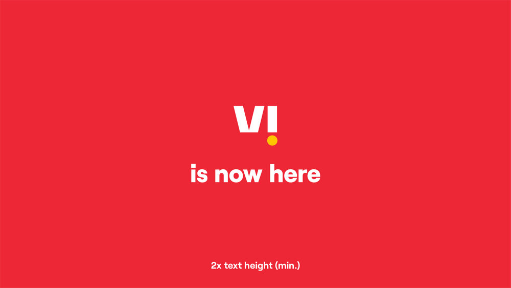
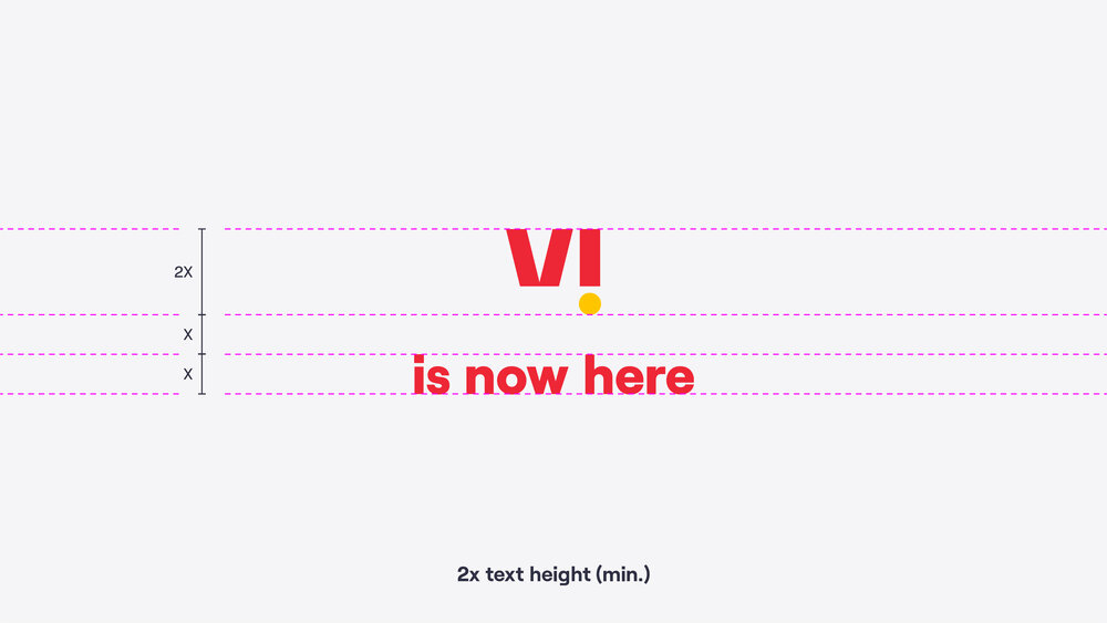
The logo should be a minimum of 2x the cap-height (height of capital letters) of the text and a maximum of 5x.
The spacing between the logo and text should be the same as the height of the text.
This layout should only be used for short, punchy headlines, not body copy or subheadings.
The logo should only sit at the start or end of the headline, not in between – e.g. ‘welcome to Vi’ rather than ‘come in and talk to one of our Vi staff members for more details’.
The logo should always sit above or below the headline, not next to it, to ensure that it is clear that this is not a logo lockup.
Local translations
In certain situations, it may be necessary to include a translation of ‘Vi’ in the local script (e.g. third-party signage). In these situations, we translate the text ‘Vi’ and type it out in the local language script. We DO NOT do anything more than this in the attempt to create anything resembling a logo.
We can only create strong brand recognition if we use one single logo, so we do not create translated logos, add a particle under the local translation, or use any colouring that reflects our logo.


Equal weighting lockup
In some states, the translation may be required to carry equal weight to our logo. In these situations, we increase the size of the translation as demonstrated on the right.


Don’ts
× Don't place our logo on backgrounds that don't provide enough contrast.
× Don't stretch or alter the forms of our logo.
× Don't recreate our logo.
× Don't house our logo in a shape that isn't part of our brand expressions.
× Don't change the colours of our logo or create new colour variations.
× Don't add effects to the logo.
× Don't insert our logo into a sentence.
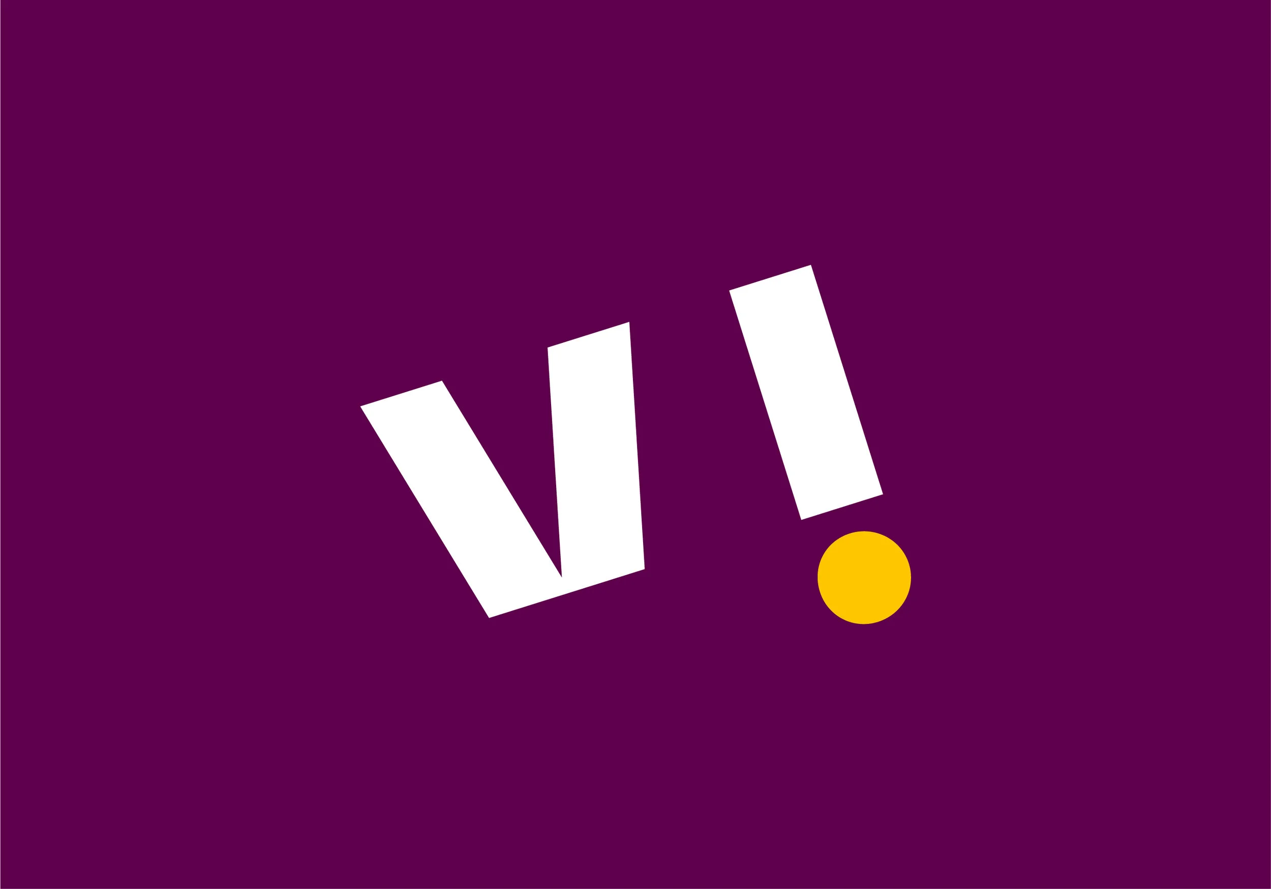
× Don't alter the spacing or rotate the logo.
× Don't type 'Vi' in all uppercase or lowercase when writing it in a sentence.
Things to remember:
01 Colour guidance should be followed to ensure brand presence
02 Space around the logo should be kept reasonably clear
03 Always write Vi with a capital 'V' and a lowercase 'i'
04 Always refer to partner brand guidelines when working with partner logos to ensure our rules work for both brands
