
Our photography reflects our brand about putting our customers at the heart.
What's on this page:
Our photography style
Our photography is simple and relatively easy to achieve while having good standout. We capture ‘real’ people with natural expressions in real environments. Backgrounds are kept relatively clear to allow our people and products to stand out and be at the centre of the brand.


Categories
We have four different categories of photography. Two for people and two for product:
People hero
People moments
Product hero
Product moments


1. People hero
Showcasing the diversity of the Vi family these images capture real, raw emotions.


2. People moments
Highlighting special moments from the lives of people enabled by Vi.


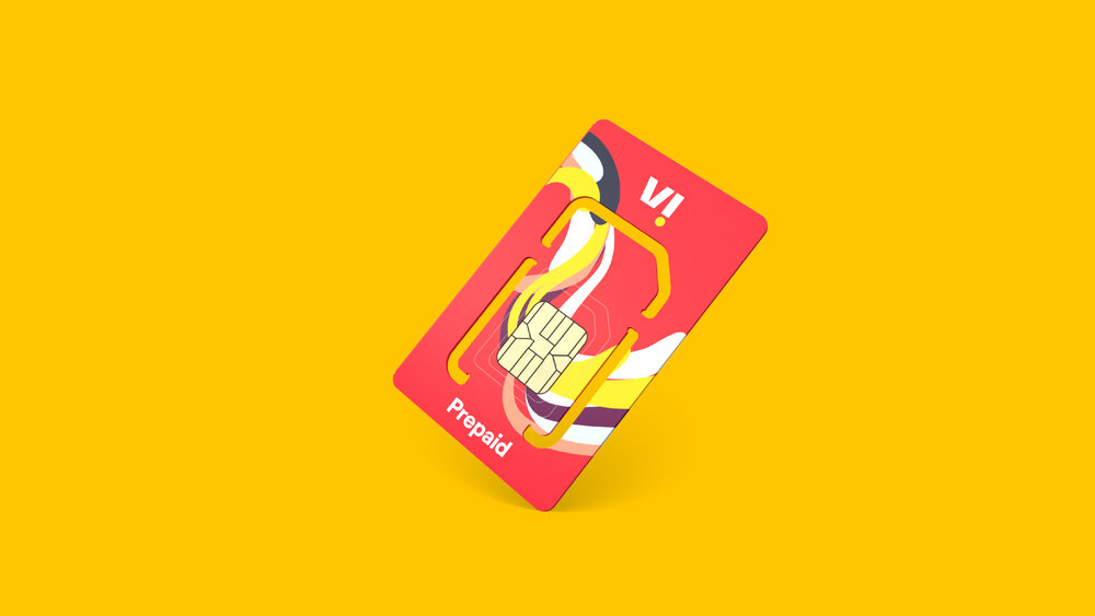

3. Product hero
Showcasing products and their features.


4. Product moments
Highlighting products in use to tell the story of how Vi enhances your lifestyle.
Guidance
To keep our photography consistent, these guidelines should be followed for image sourcing or shooting.


Casting
Our photography should showcase and celebrate a wide range of people in our customer base.
Showcase a range of people across a range of ages, genders, backgrounds etc.
Feature ‘real’ people, not just people who look like professional models.
Dress, hair, and makeup should all feel authentic to the person.
Cast people with expressive and outgoing personalities to capture the energy of the brand.


Background
Keep backgrounds solid and relatively clear to allow our people and products to stand out.
Backgrounds should be predominantly one colour; it can be solid or textural.
Photography shouldn’t be shot in studio environments. Keep environments real with texture and tone. The image shouldn’t look like a cutout.
The background colour should be picked or edited to closely match a colour from our palette. When this is not possible, ensure that the composition has a strong red or yellow presence.


Lighting and colour
Create an inviting and relatable feel with realistic lighting and colour.
Use lighting to cast soft shadows that bring out the textures of the environment. Our images shouldn’t look like cutouts.
Everything should be in focus and sharp, avoid using heavy depth of field.
Images should look naturally white balanced, not stylised or over-edited.
Wardrobe + environment shouldn’t be overly contrived to feature too much of our colour palette or only our colour palette. This isn’t realistic and can appear cheesy.

Composition
Our photography should work for the brand and the way we express ourselves. Ensuring there is sufficient negative space in imagery is essential.
Use negative space in the image to create a focus on the subject and to allow future text overlays etc.
Focus on the subject and the activity by keeping the composition simple. Having the main subject centred in the frame can help with this.
Photography in use
The following examples demonstrate how our photography can be used in the Vi design system. See the system pages for more guidance on how photography comes together with the rest of our elements.


Don’ts


× Don't use cutout images apart from for product hero images.


× Don't use images that have no clear/negative space.


× Don't use heavy depth of field.
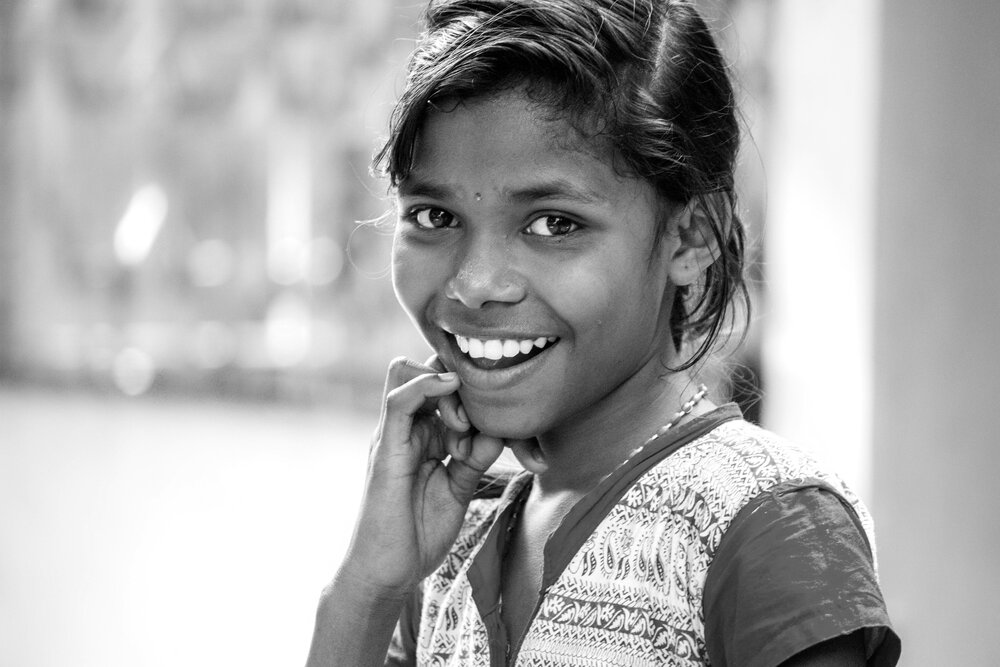

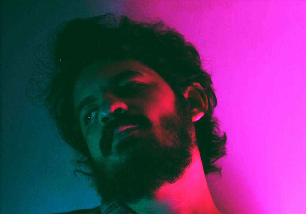
× Don't use black and white images or images that have a very strong presence of a colour that isn't in our palette (or is not neutral).

× Don't overly edit images or use overly styled shots.
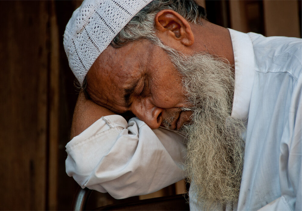

× Don't use images of people who appear unhappy.
Things to remember:
01 Unless we're using a product hero image, our photography should focus on people
02 Our photography should feel as authentic as possible
