
Layout guidance helps us compose brand elements and expressions in the correct formats.
Please note that the layouts detailed in this section are not exhaustive, they should be used as a starting point and can be customised as appropriate. Different versions of these layouts are possible depending on composition and purpose.
What's on this page:
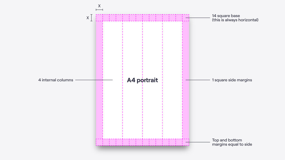
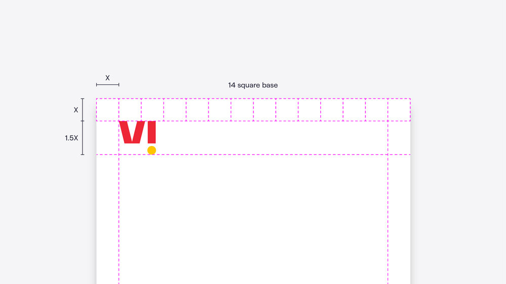
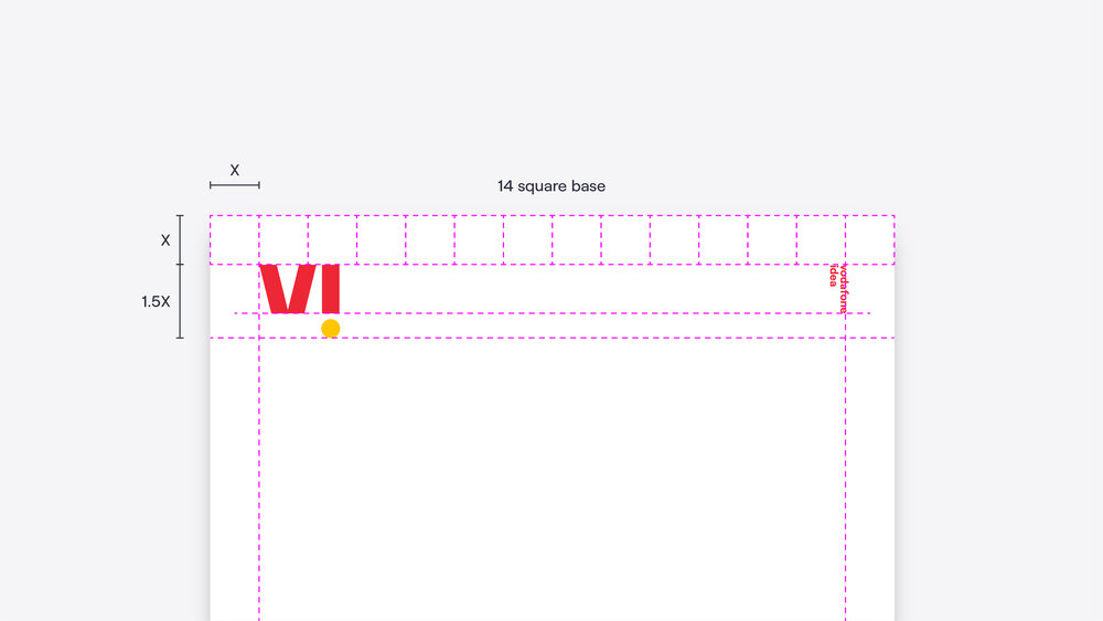
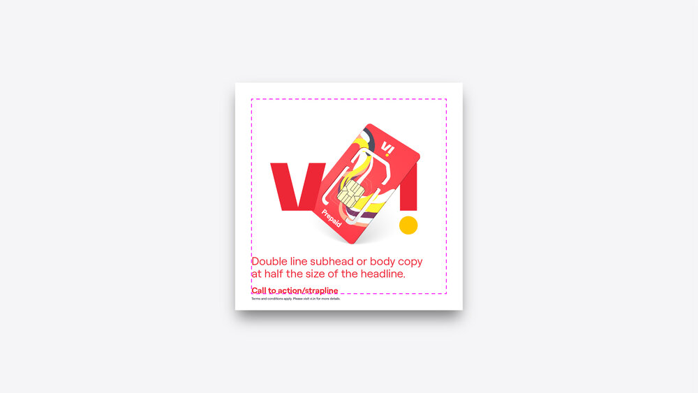
Grid + margins
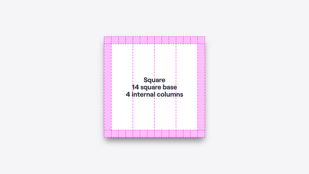
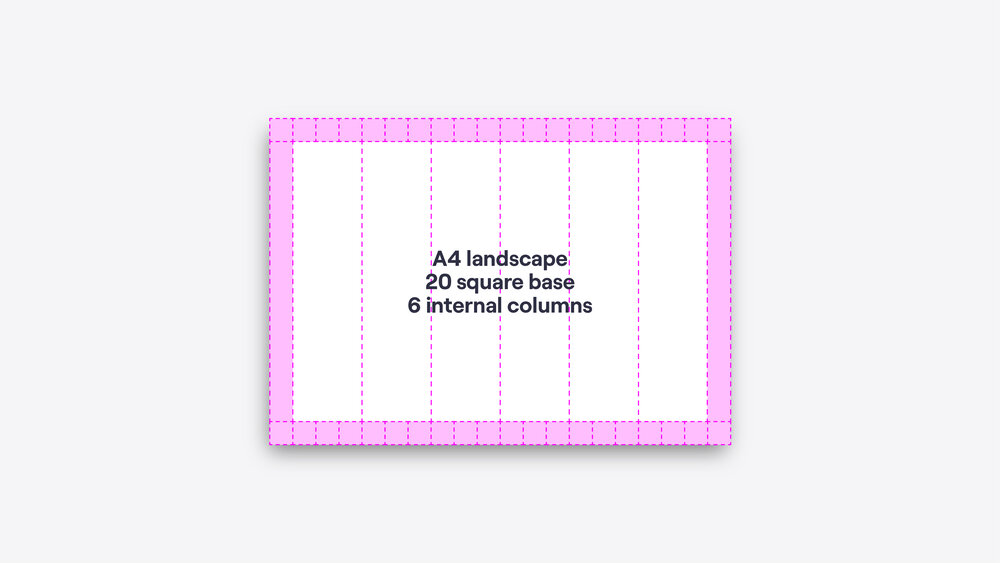
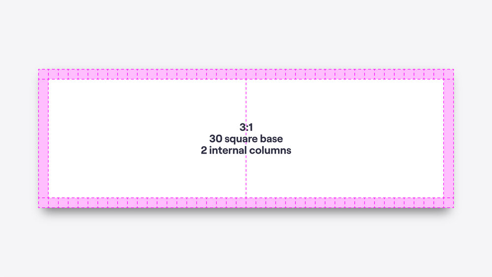
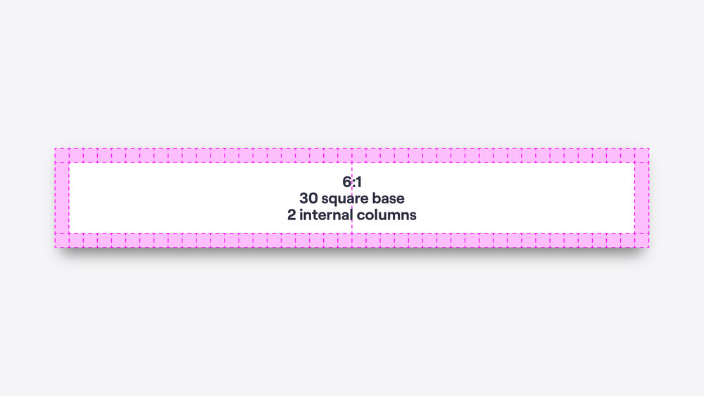
Our margins are based on a simple grid with principles that stay constant even as the number of columns grow and shrink across different format ratios.

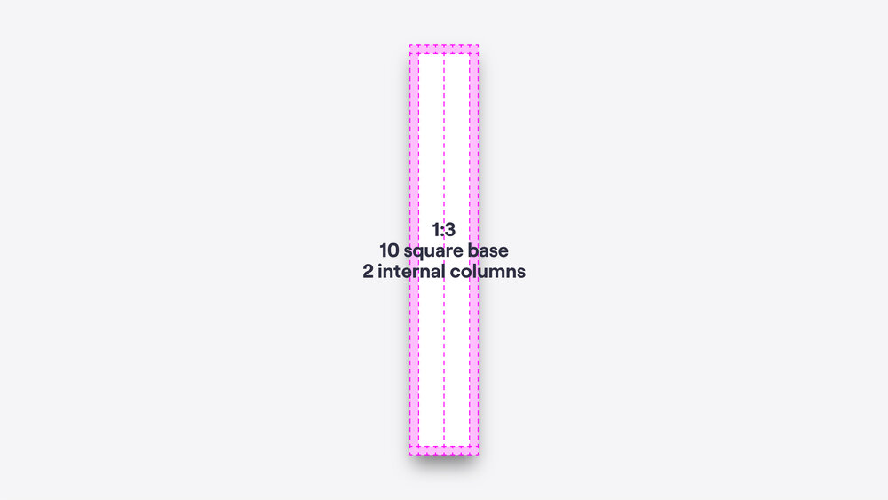
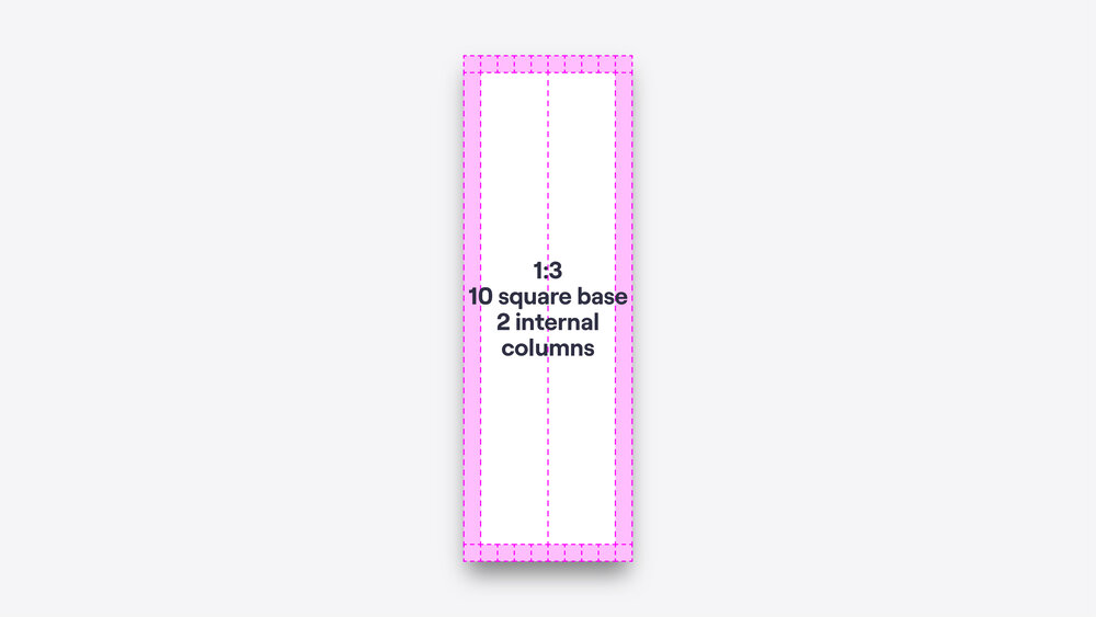
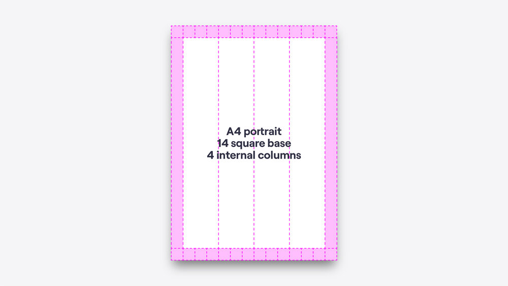
Flex
This guide shows examples of how our grid flexes across different formats.


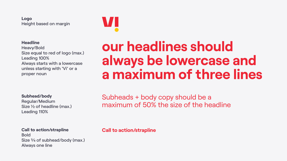
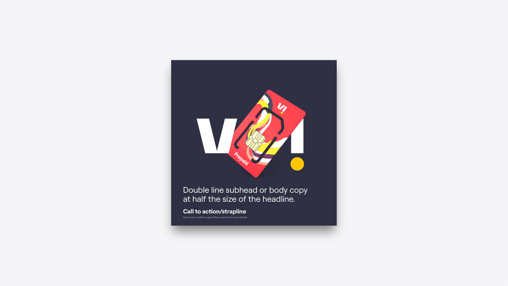
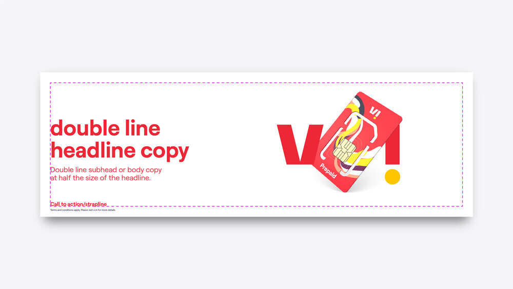
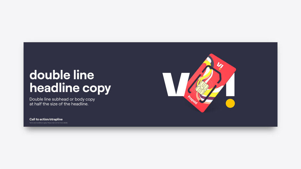
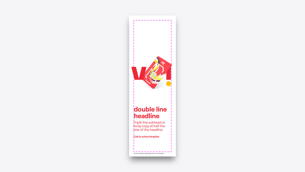
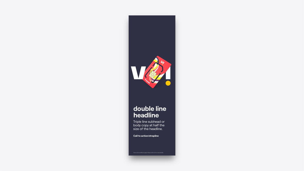
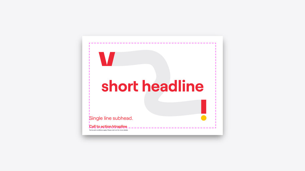
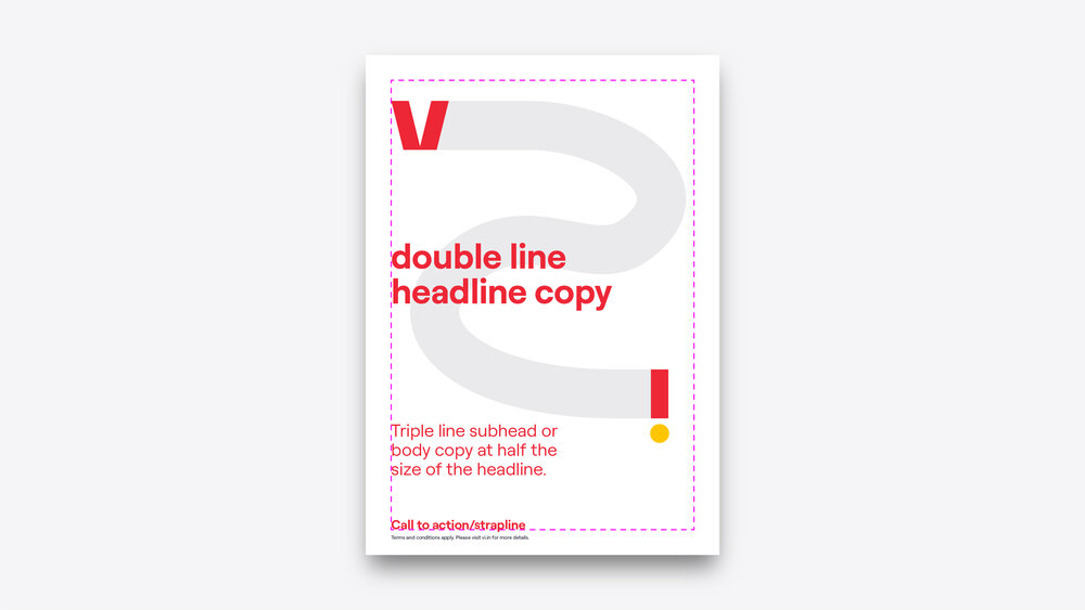
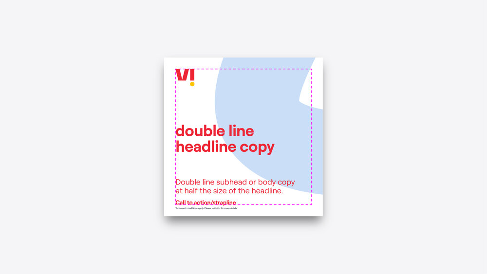
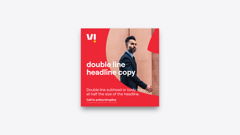
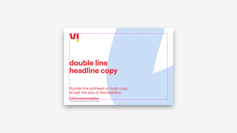
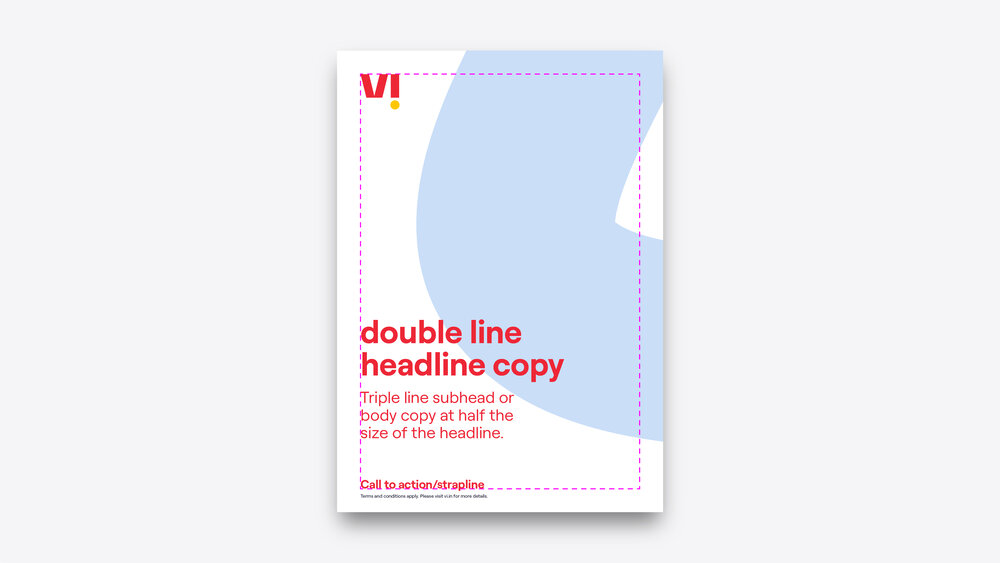
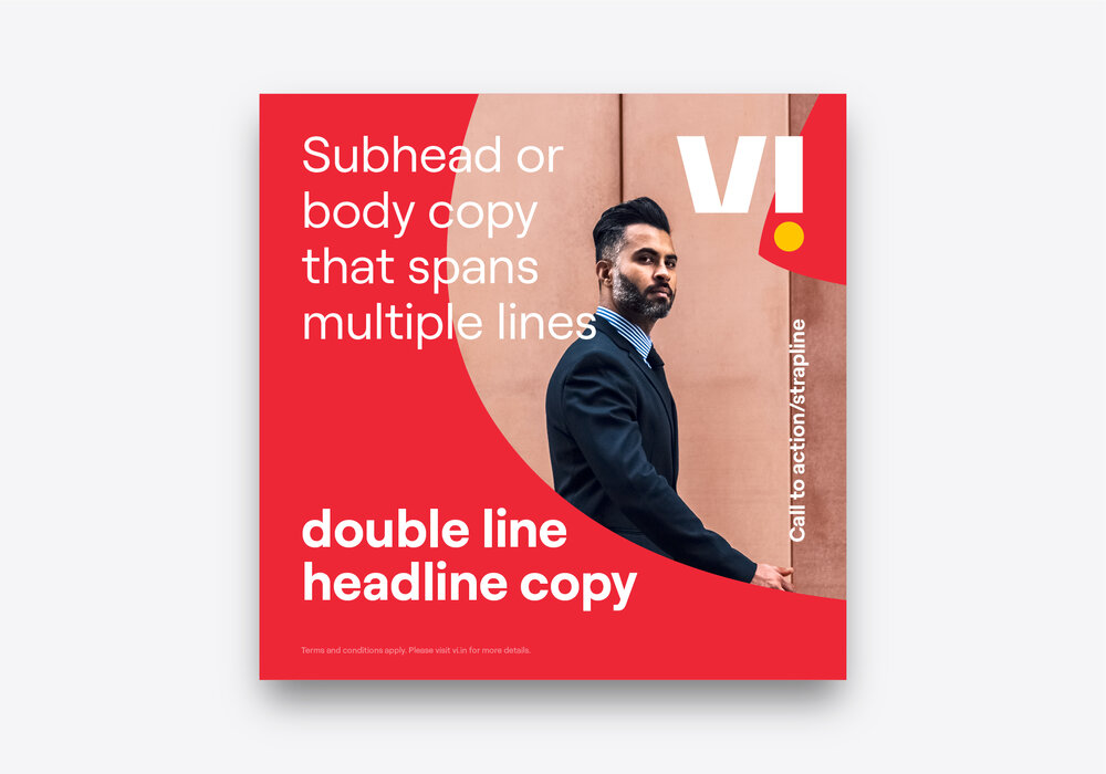
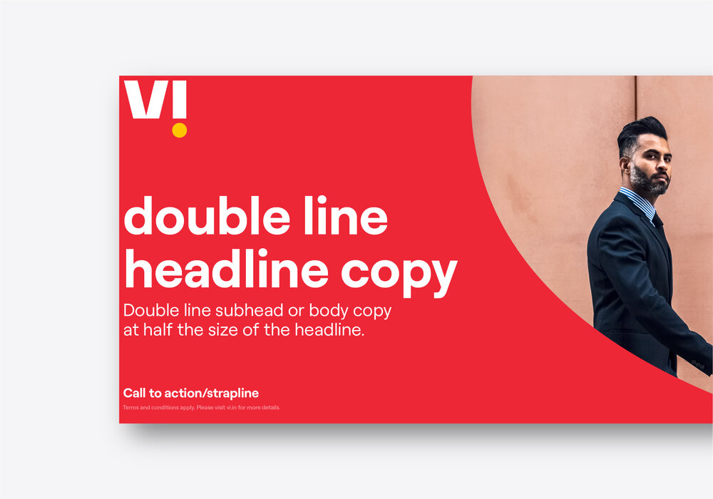
Hierarchy
Our layouts are all based on a simple hierarchy of elements that can work across any format and can flex to include any combination of items. These elements should have a minimum of 1/2x spacing between them (see above diagrams on how to find ‘x’).

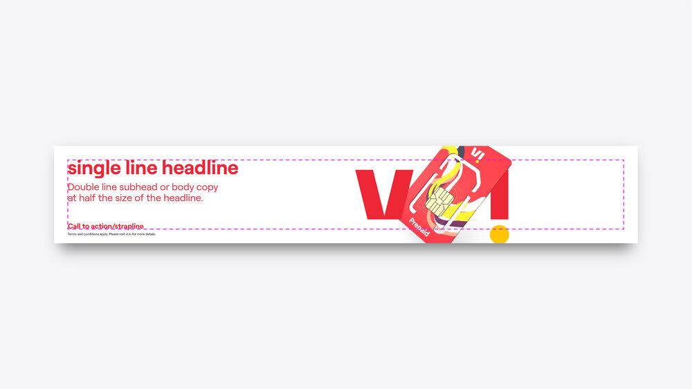
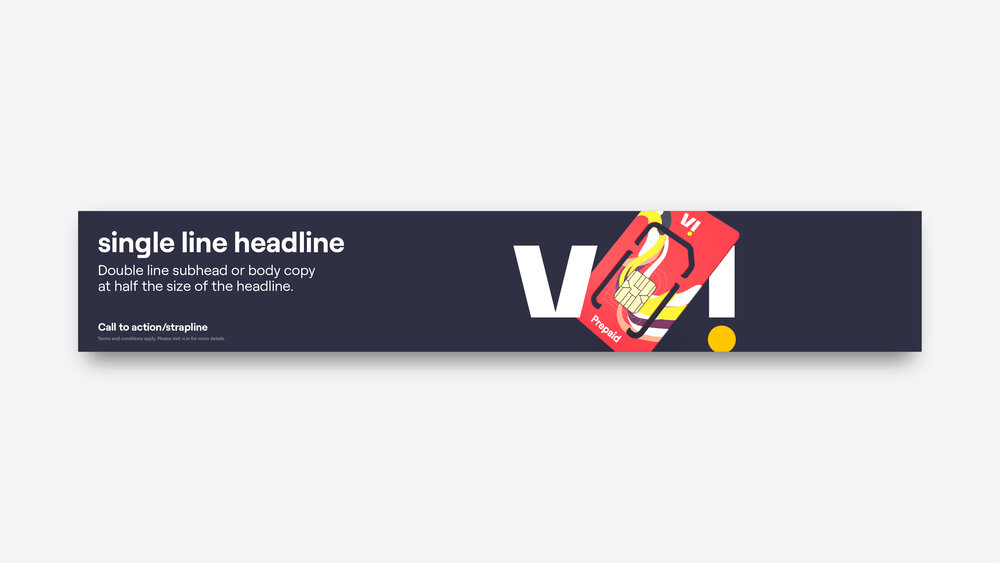
Strapline
Note that our call to action and strapline occupy the same space – this is due to our strapline being very directive. We should avoid using our strapline in executions with a call to action and should use it by exception (rather than by default) only.
Logo placement
Our logo and any lockups can be arranged by following this simple guide. The height should ideally be equal to 1.5x the margin even as grids change across different formats. Our logo and any lockups should ideally be placed along the top of the composition.
Note that this isn’t a strict rule as every composition has different requirements and different amounts of content, use this as a starting point and change if needed.


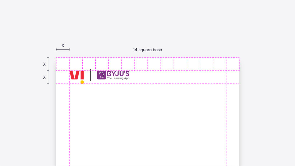

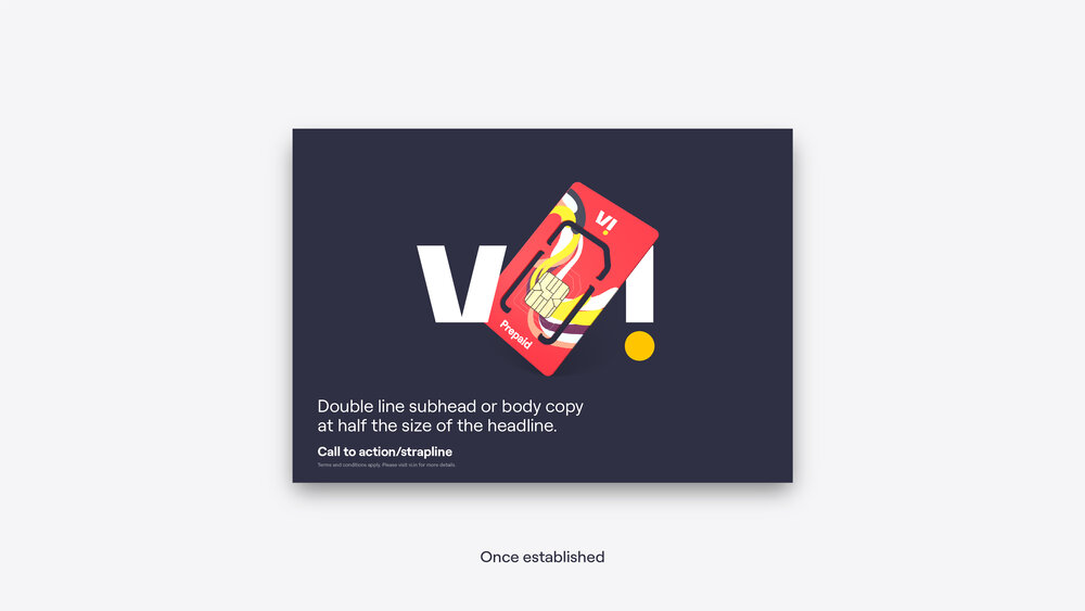
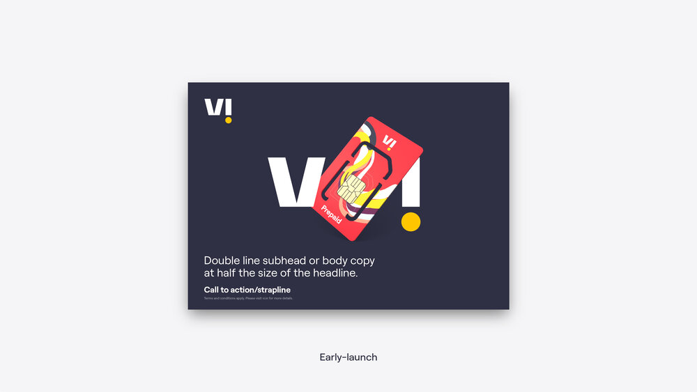
Newly-launched vs. established
This section focuses mostly on compositions made once the brand is established as this will quickly become the norm. However, in the early days of the brand launch, it may be necessary to treat the logo in a slightly different way to ensure that the logo is always present in its complete, unopened form.
This may mean that some of the first designs in the new brand appear to have two logos when using the frame or trail expression.
The decision of whether to use two logos should be lead by guidance from the brand team and the context of that piece of communication.


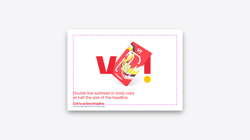
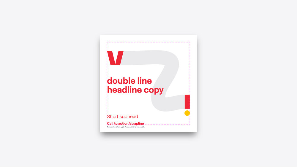
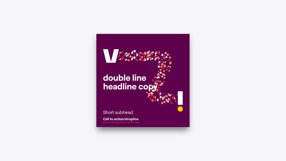
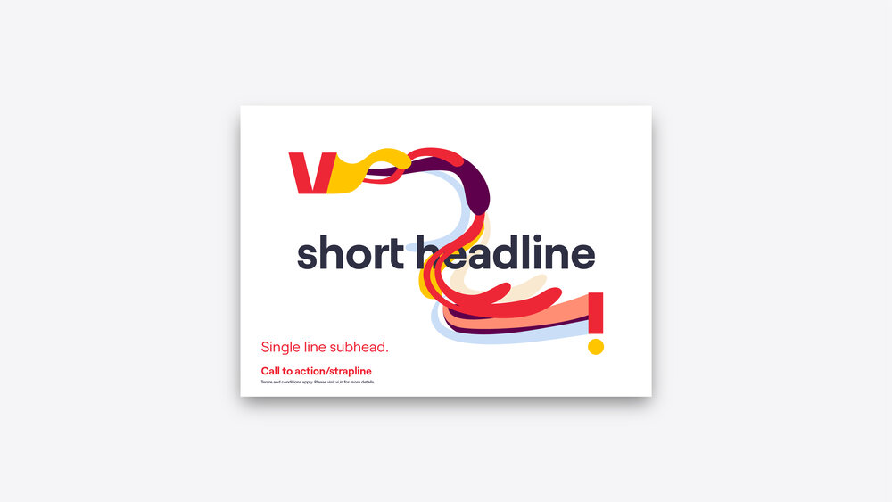
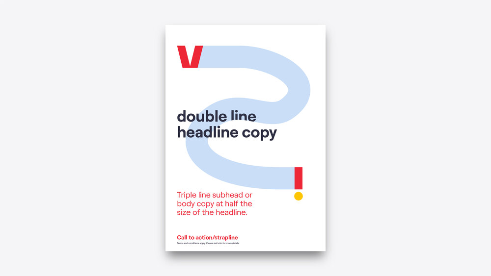
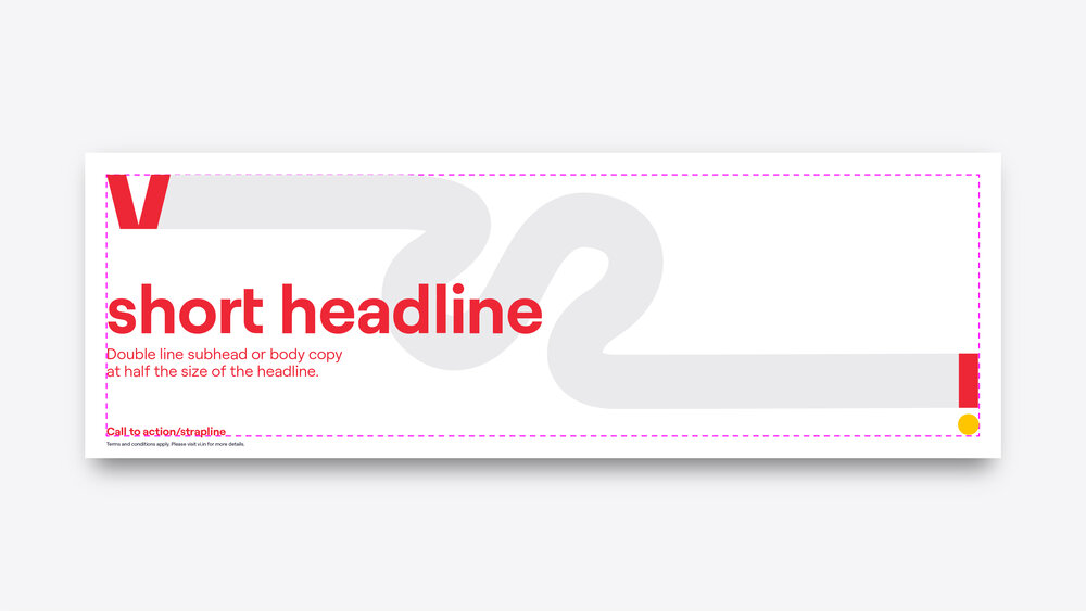
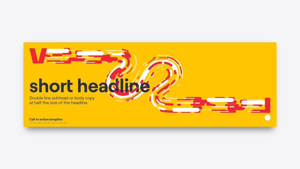
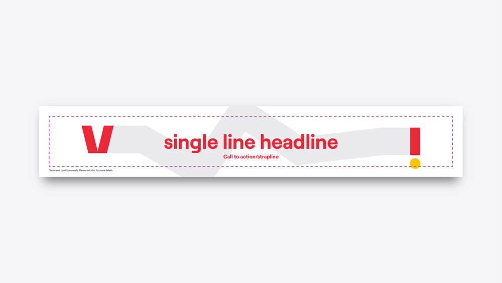
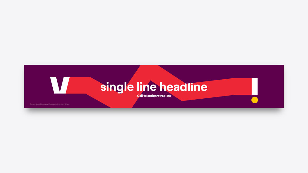
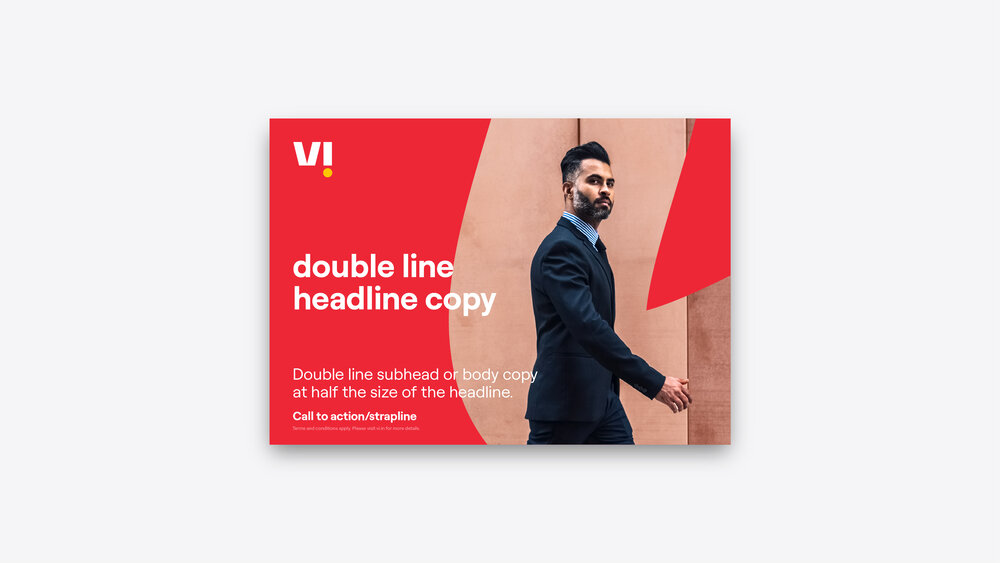
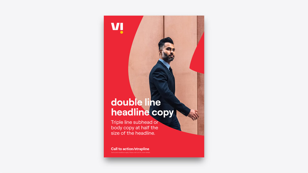
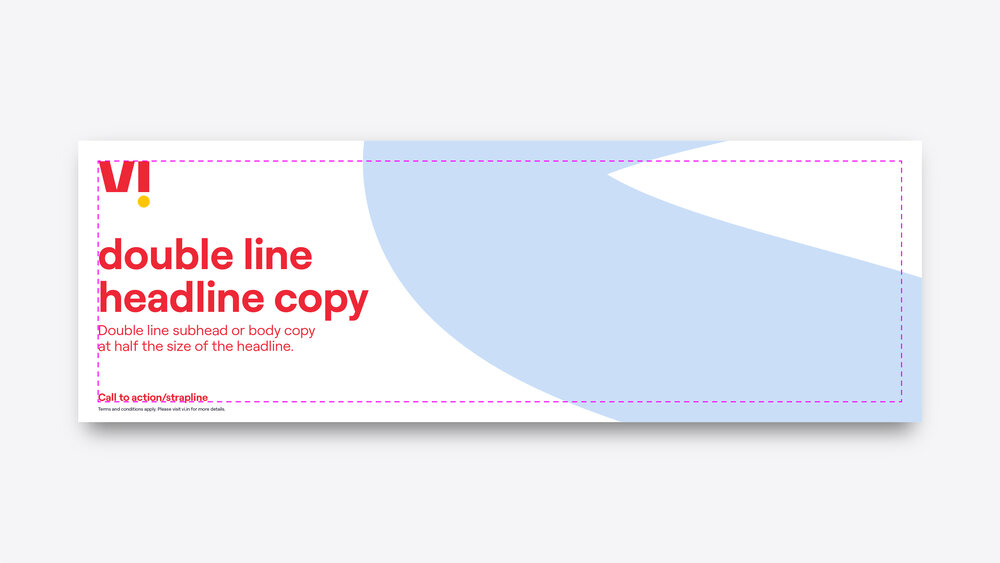
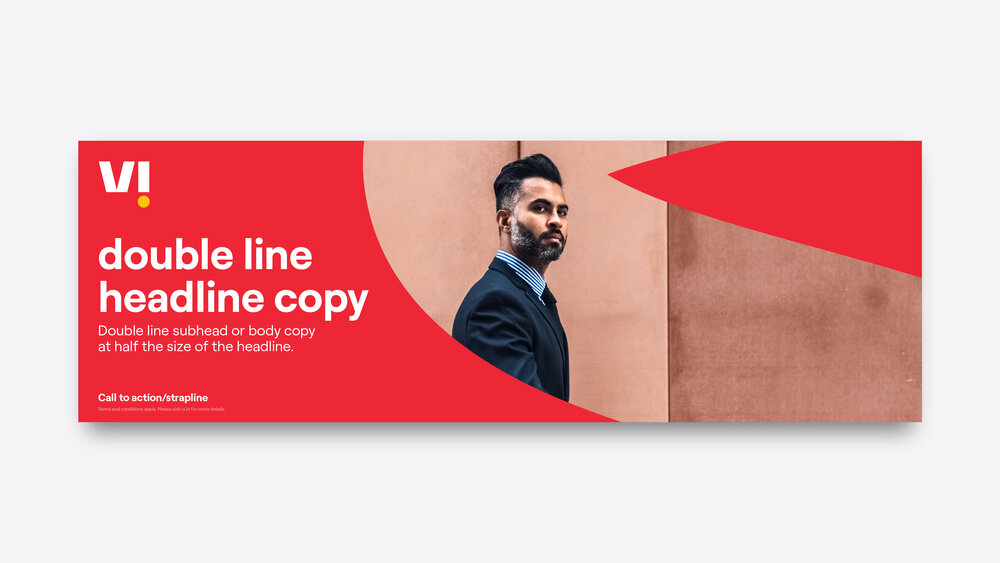
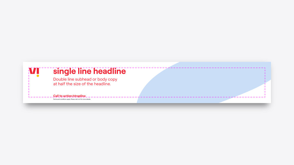
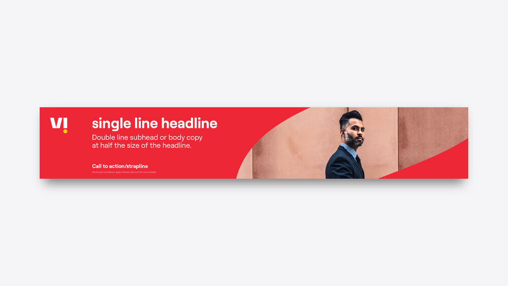
Frame expression
The following show how our frame brand expression can be applied to various layouts. This isn’t exhaustive of all formats or options, these are simply examples of how the frame expression can be used on different layouts.
See the brand expression section for more guidance around different ways to execute the frame expression.


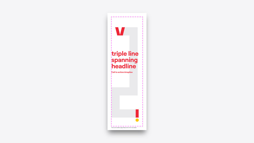
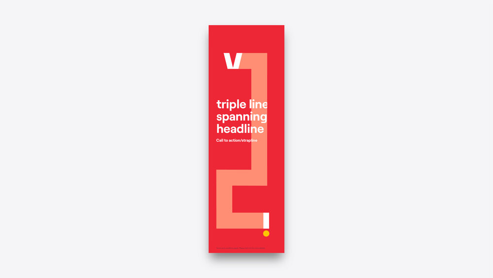
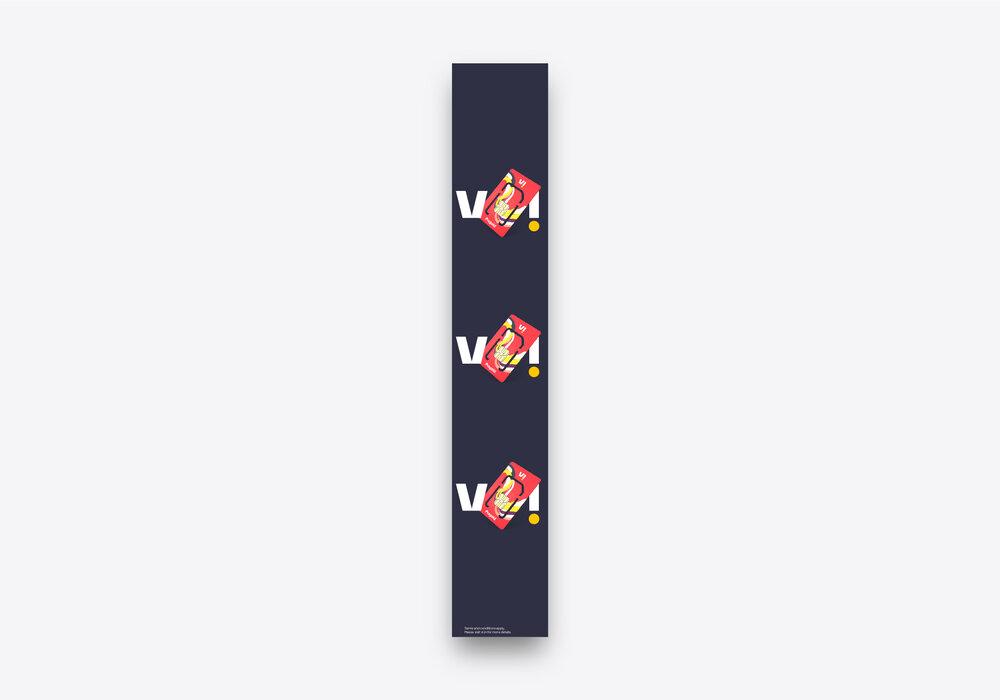
Extreme formats
This is when we would likely need to rethink the standard layout guidance to ensure that our compositions are successful. This will usually require using less content. Horizontal extreme formats work with our brand expressions better than vertical – for extreme vertical formats, our crop expression works best.


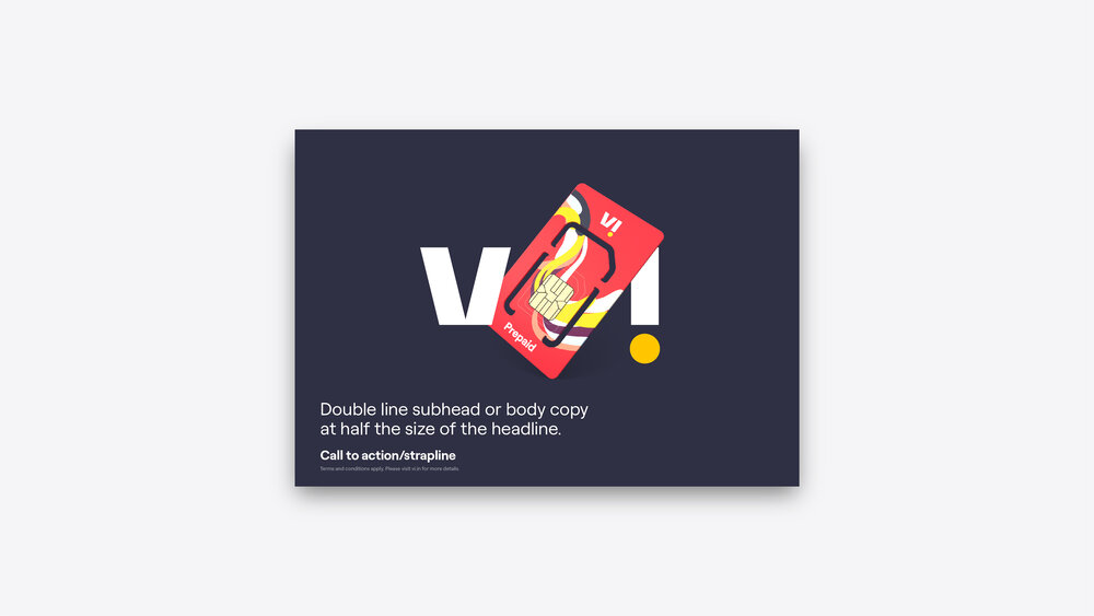
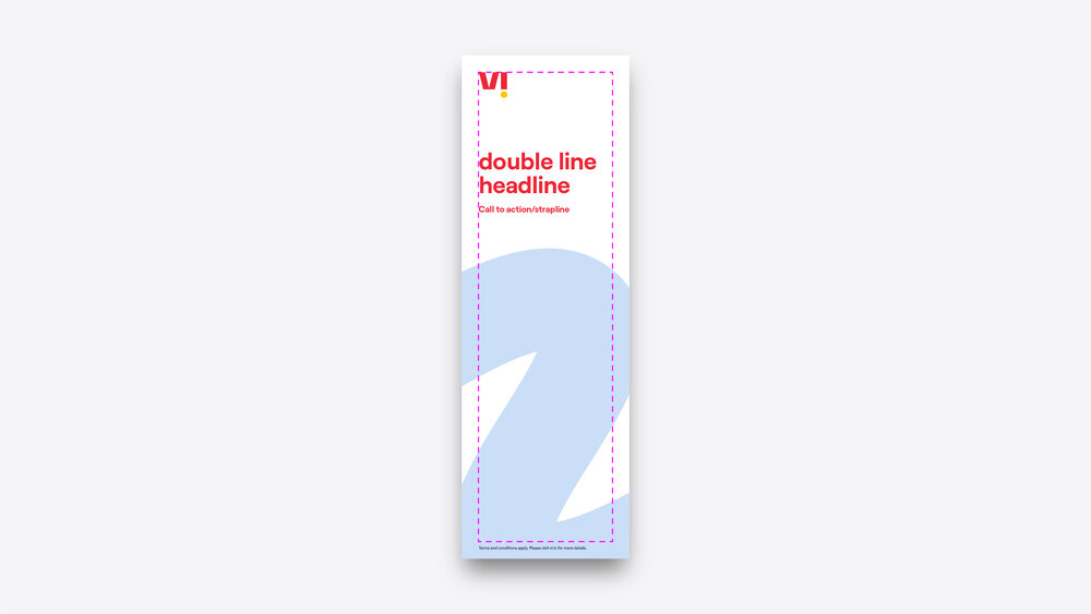
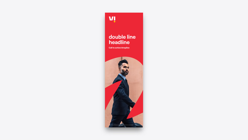
Trail expression
The following show how our trail brand expression could be applied to various layouts. This isn’t exhaustive of all formats or layout options, these are simply examples of how the trail expression can be used for different layouts.
See the brand expression section for more guidance around different ways to execute the trail expression.


Extreme formats
This is when we would likely need to rethink the standard layout guidance to ensure that our compositions are successful. This will usually require using less content. Horizontal extreme formats work with our brand expressions better than vertical – for extreme vertical formats, our crop expression works best.


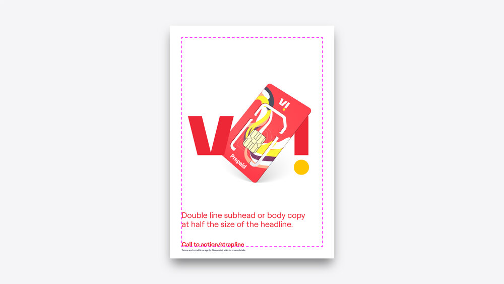
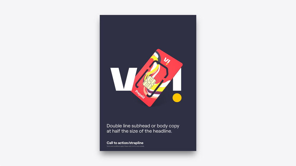
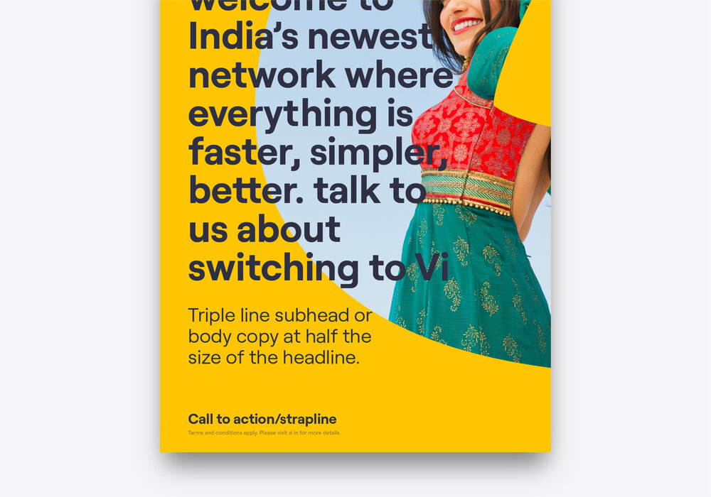
Crop expression
The following show how our crop brand expression could be applied to various layouts. This isn’t exhaustive of all formats or layout options, these are simply examples of how the crop expression can be used for different layouts.
See the brand expression section for more guidance around different ways to execute the crop expression.


Extreme formats
This is when we would likely need to rethink the standard layout guidance to ensure that our compositions are successful. This will usually require using less content. Our crop expression handles extreme formats best and should be used for all extreme vertical formats.


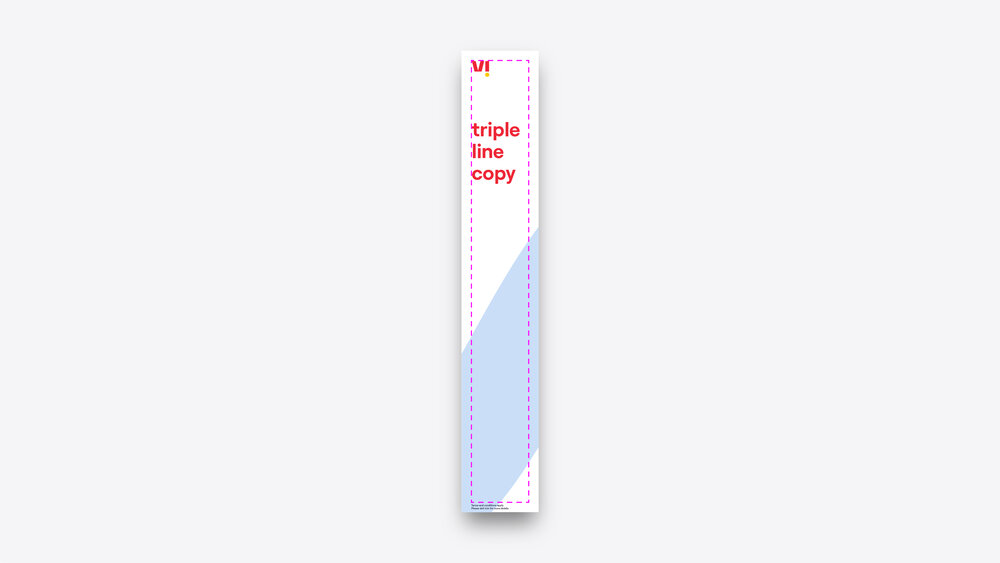

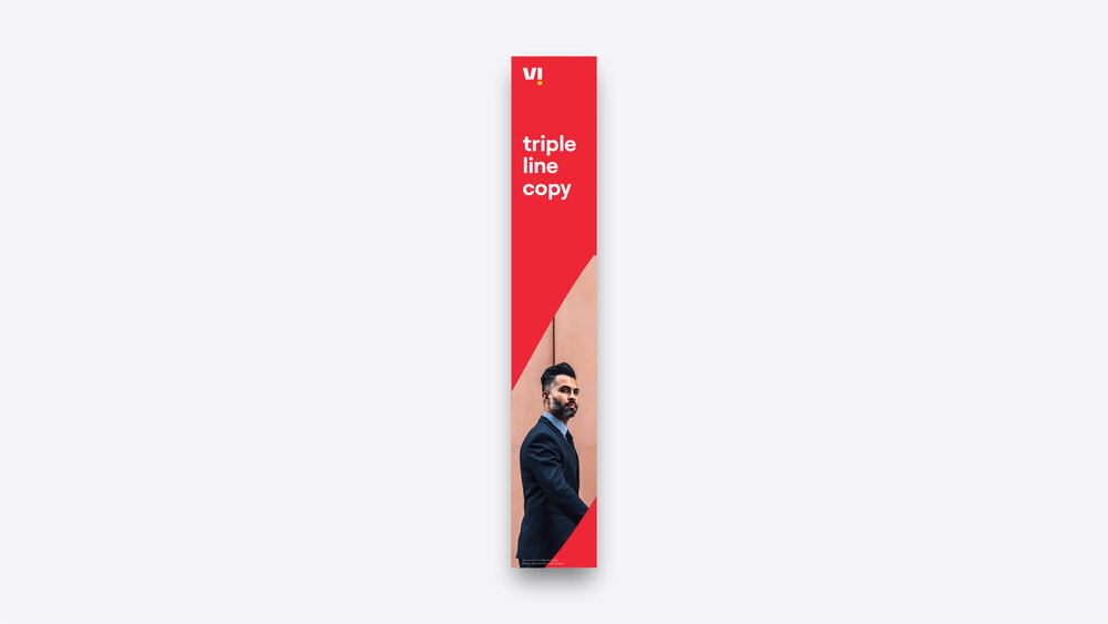

(Our crop expression is the best expression for extreme vertical formats)
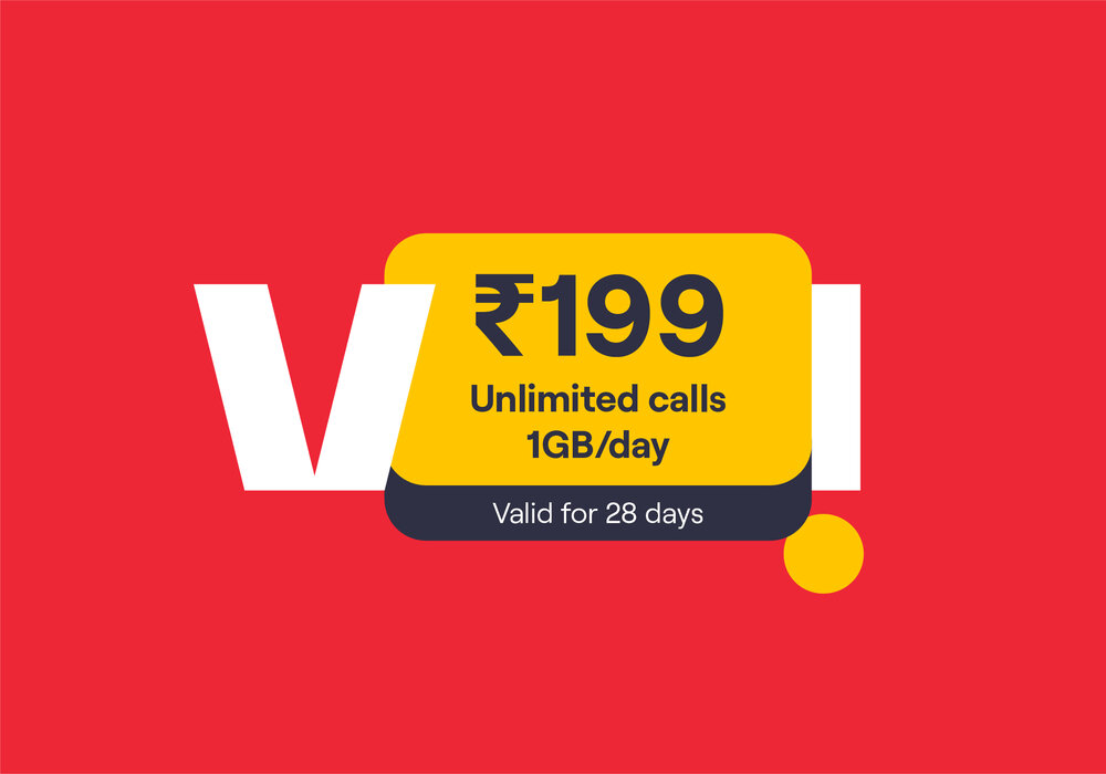
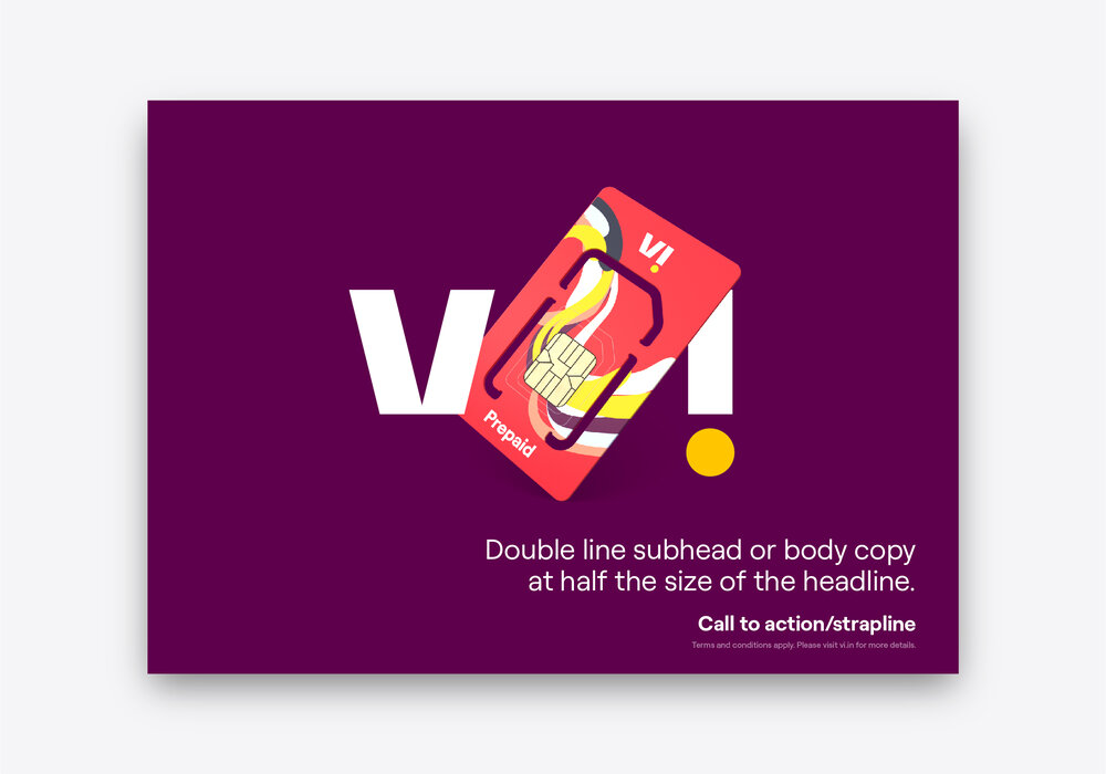
Price points
Price points allow us to hero price points within layouts for maximum impact. One way to do this is with our price point capsules which can either be the hero element within a layout or sit at the bottom as a call to action.
For more guidance on how to work with price point capsules, see our typography section.


Don’ts

× Don't use frame or trail expressions in extreme vertical formats or repeat expressions to fill space.

× Don't change our hierarchy or rotate elements.

× Don't place elements beyond the margins (apart from terms and conditions).

× Don't use price points in frame expressions.

× Don't use too much text in headlines.

× Don't right-align text.
Things to remember:
01 The layouts shown are only a starting point
02 Our strapline is rarely used
03 Our crop expression is best suited to extreme size formats
